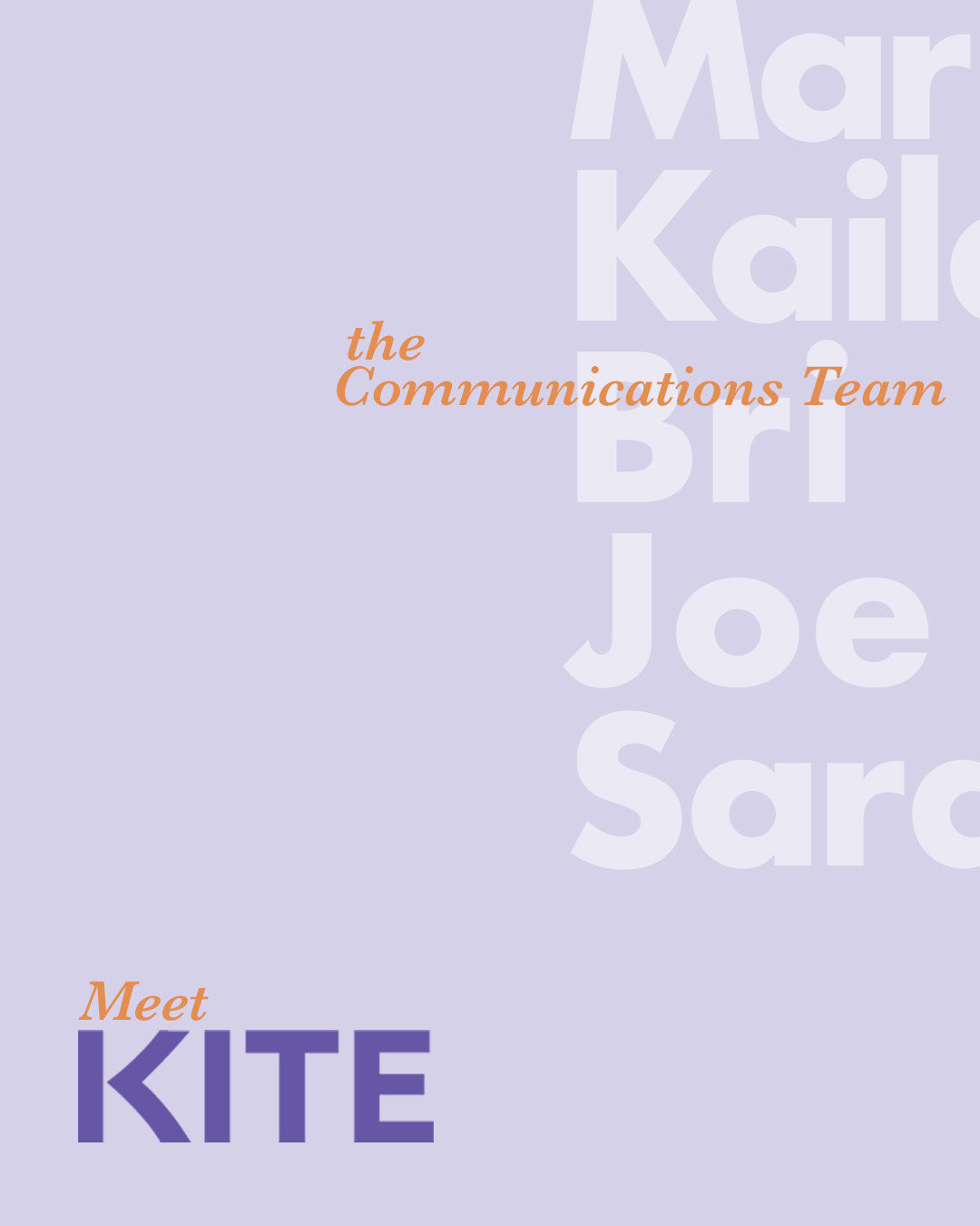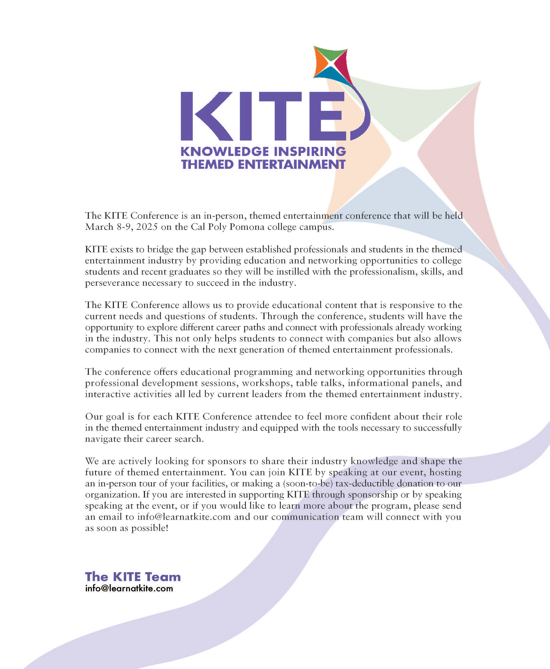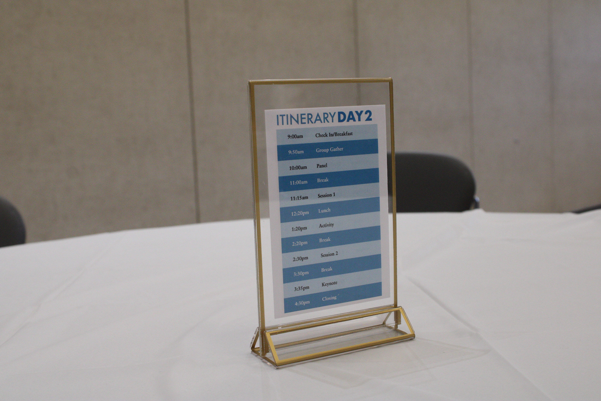
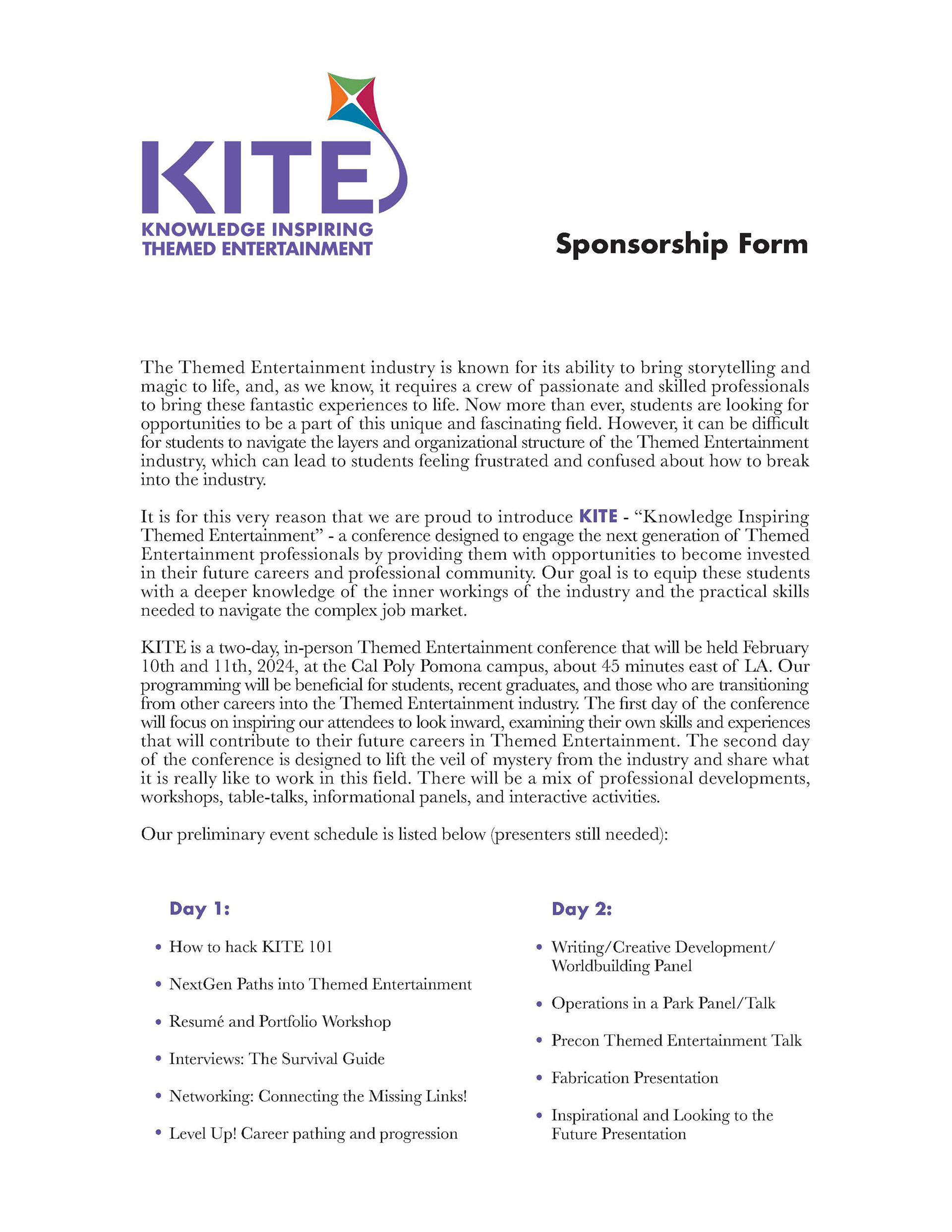
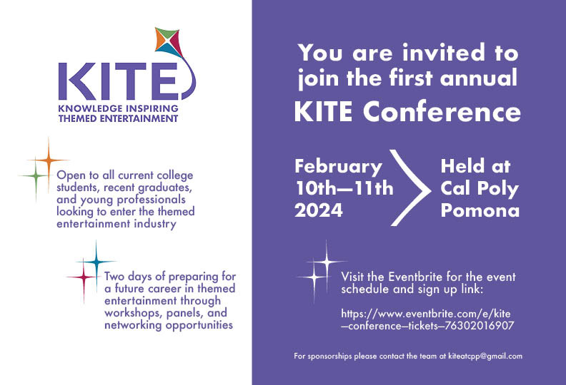
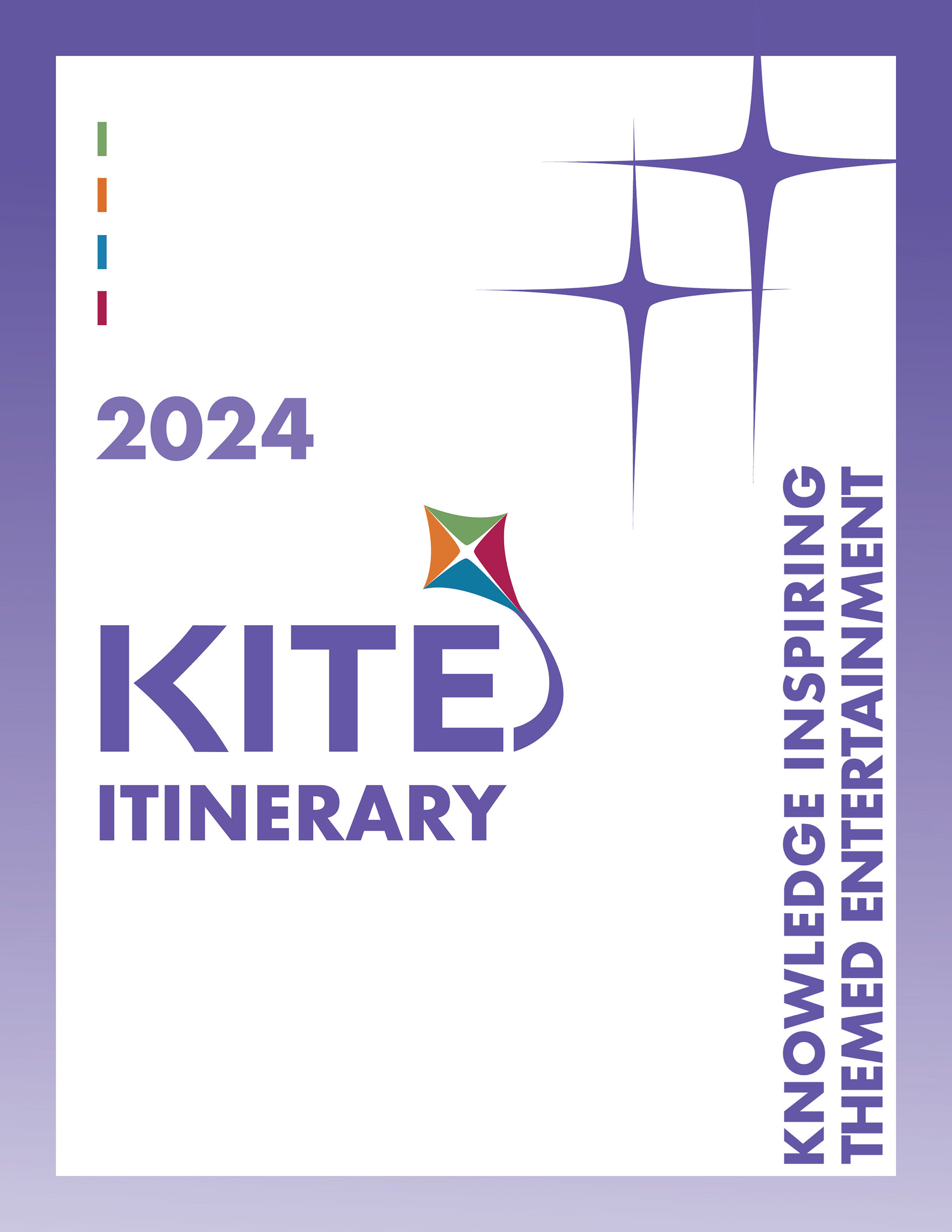
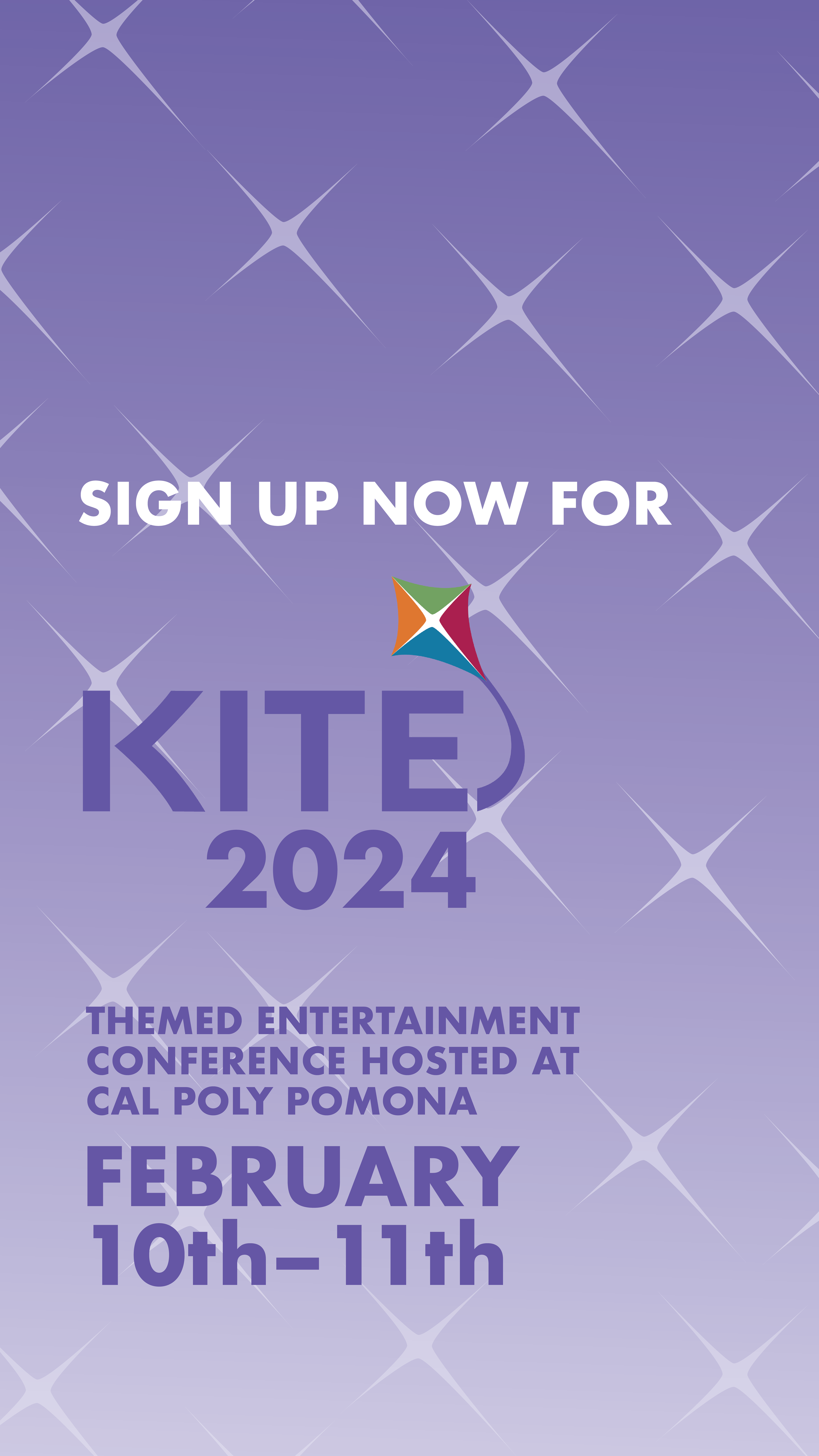
The first annual KITE Conference was put on as a collaborative effort by young professionals of the Themed Entertainment industry with the goal of inspiring and equipping students with the knowledge and skills needed to pursue their dream career. Held on the Cal Poly Pomona campus, KITE welcomed Themed Entertainment companies and industry professionals to give talks, sit in on panels, and share their experiences and expertise with conference goers. Students were encouraged to network with these professionals as well as each other, in order to start building their first steps into the Themed Entertainment industry.
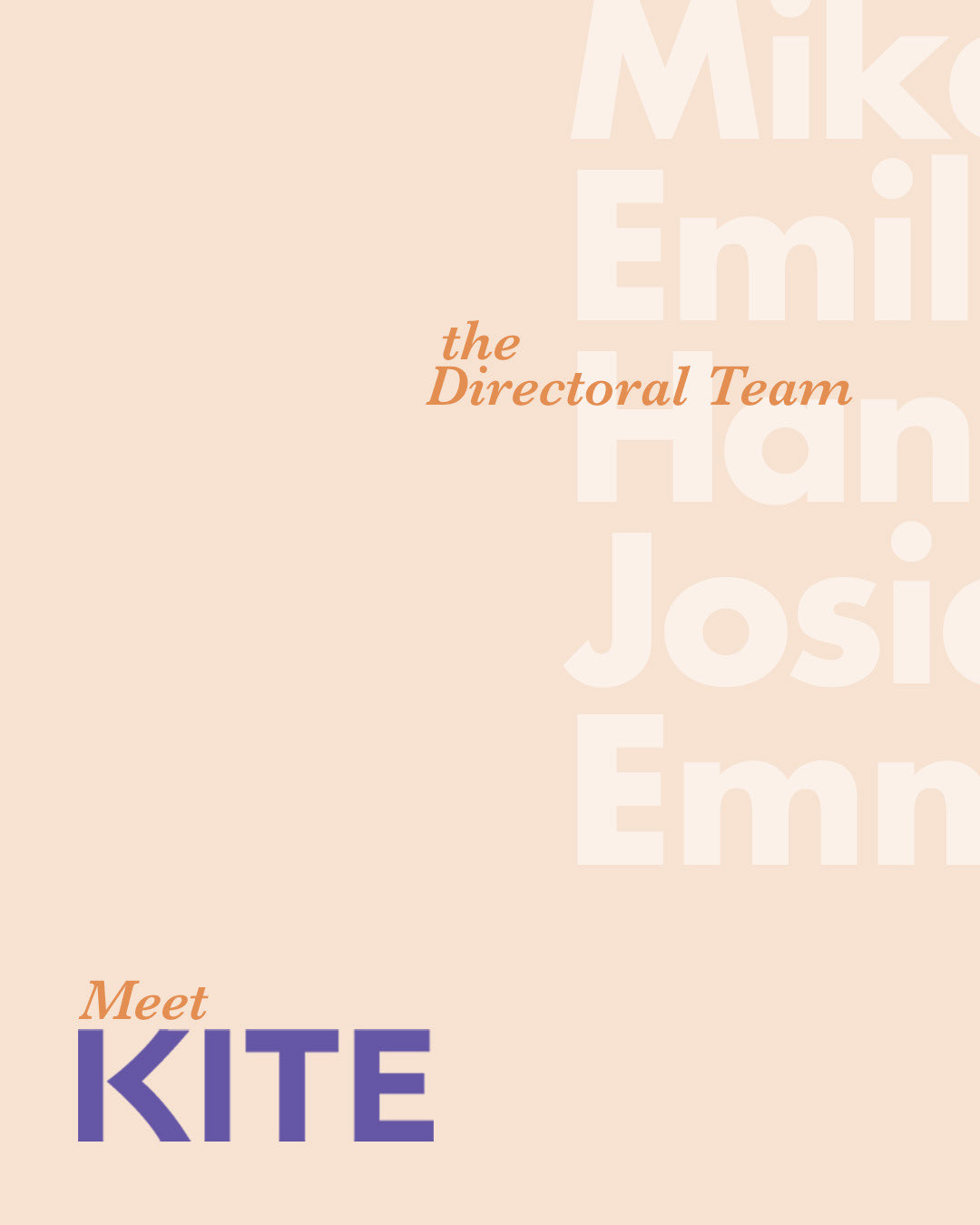
As a recent alumni, I was approached by some of my peers still currently at Cal Poly Pomona about designing for the conference. I accepted the task and about 10 months before the first conference was held, ideation began. I am now in my second year as Art Director for KITE
BRANDING
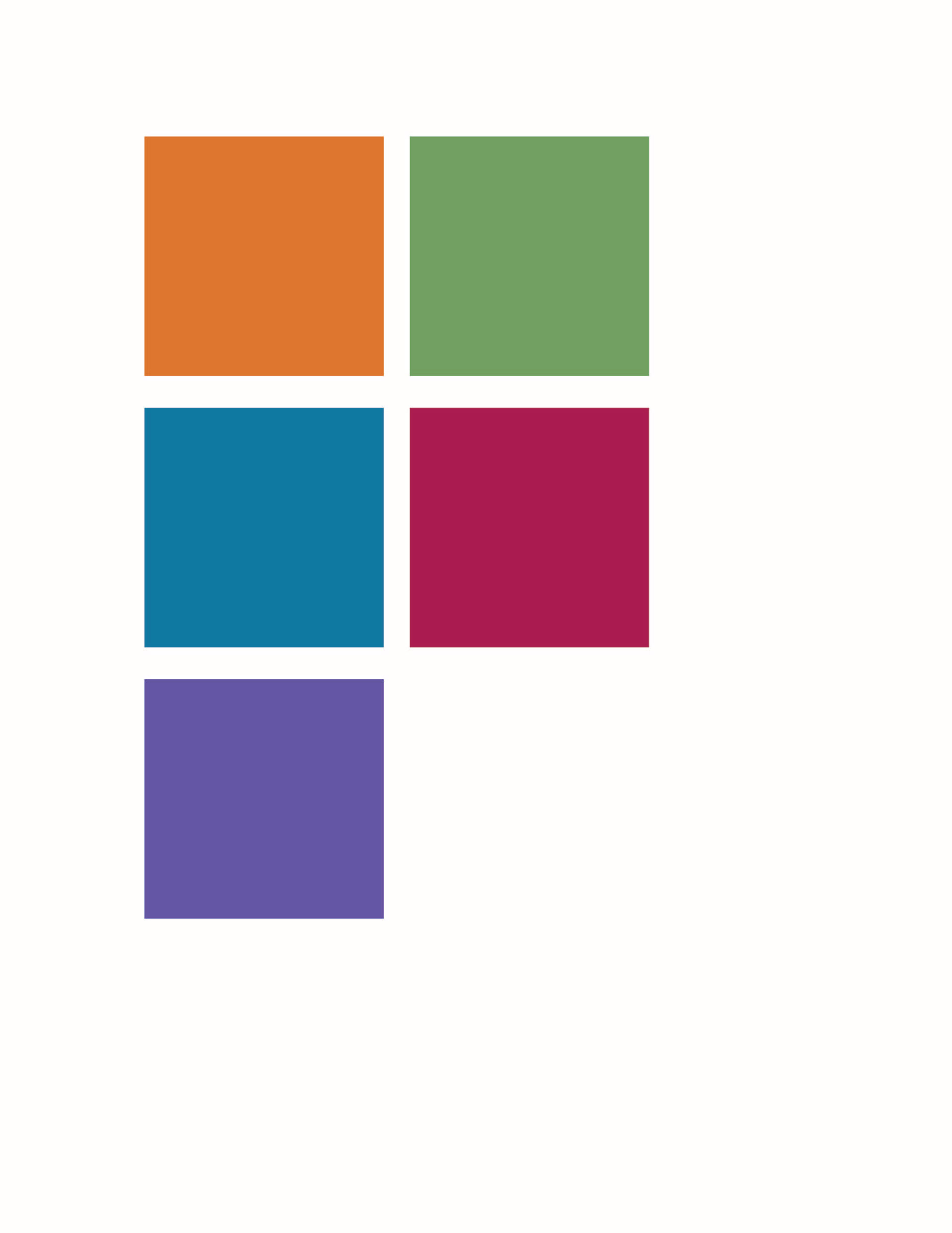
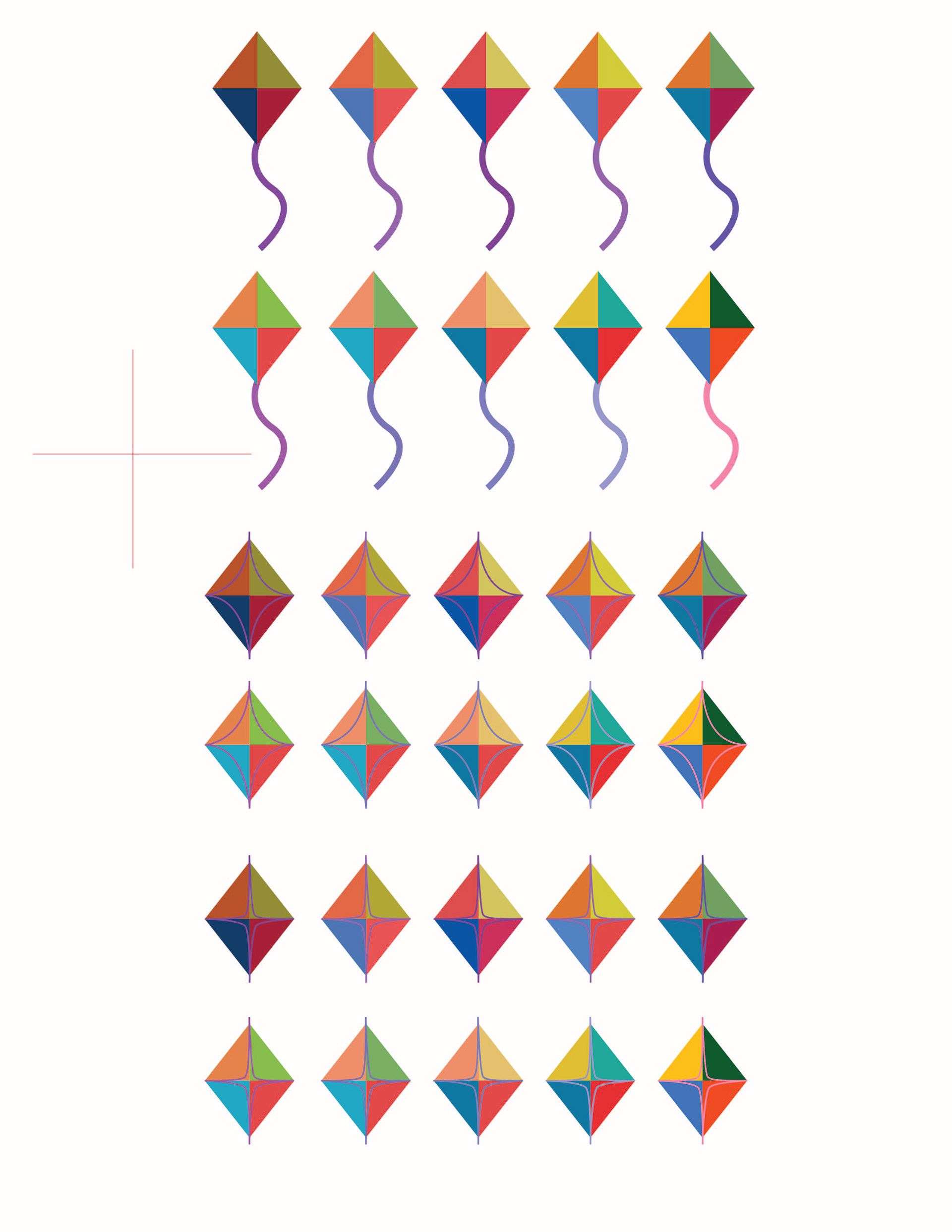
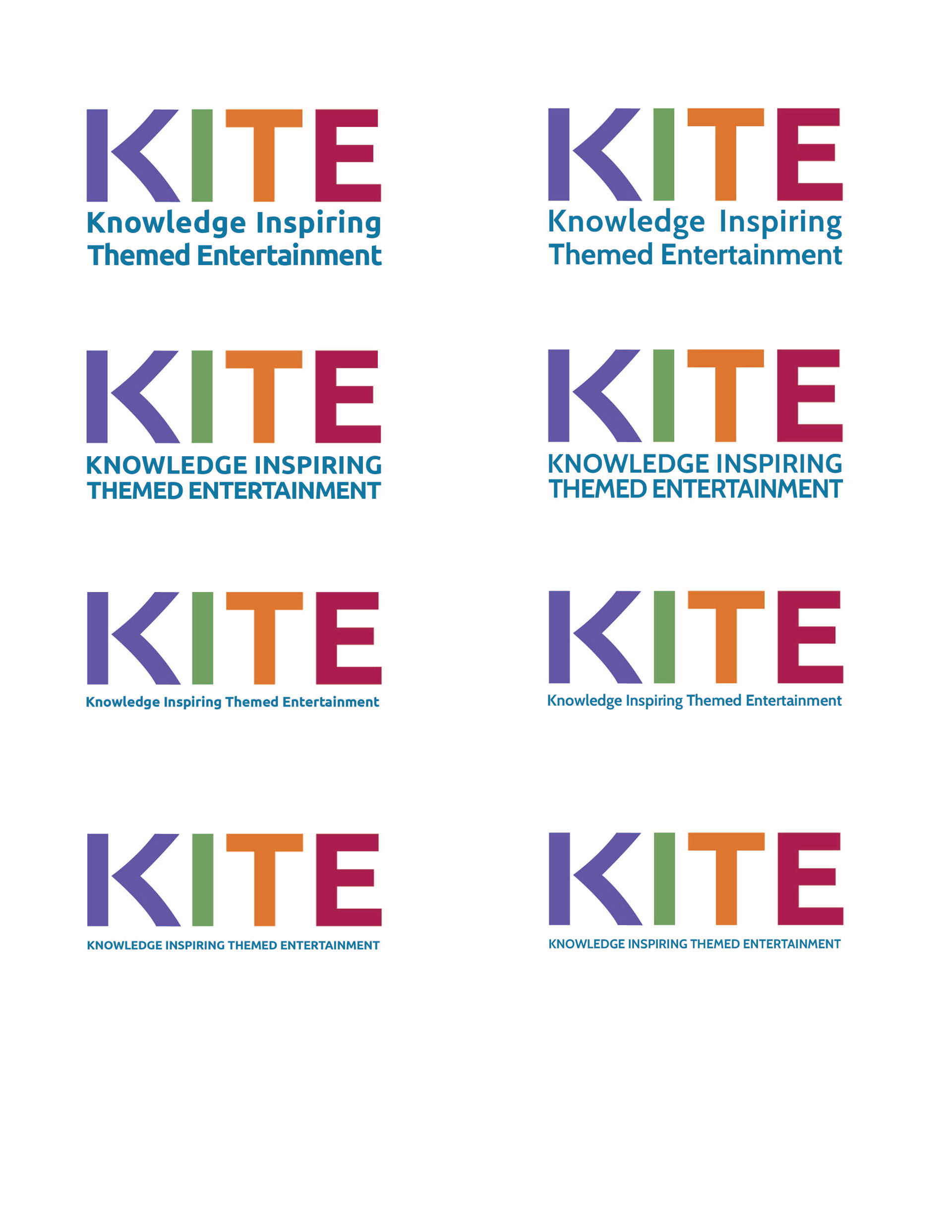
So far we had a name and a general vibe the team was hoping for. We wanted the type and the color story to be reminiscent of the professional organization most of the industry are members of. After all, our college chapter of the organization is what brought us all together, and we knew most of our participants would be members of their college chapters as well. With that being said, a younger audience called for more vibrant colors, and encouraged me to be a little more playful with the type.

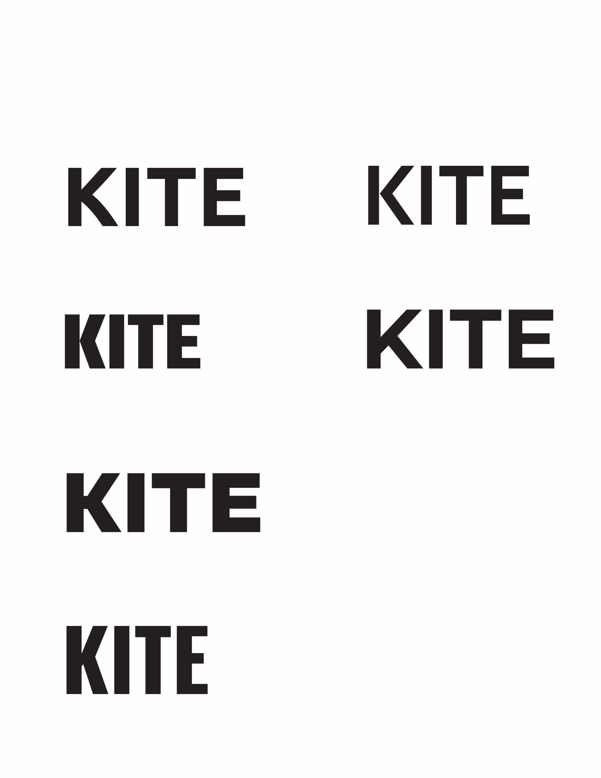
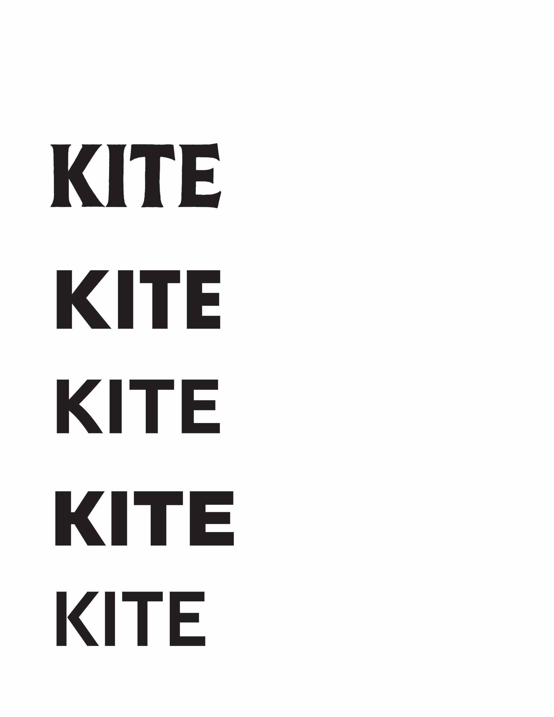
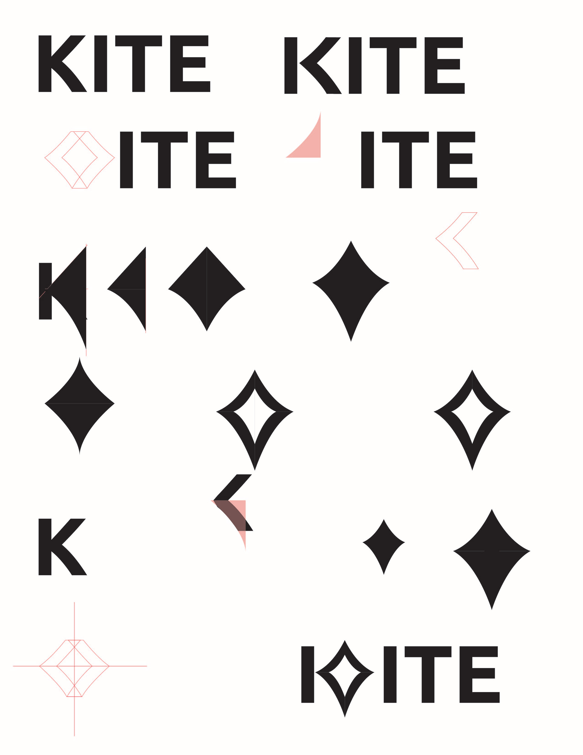
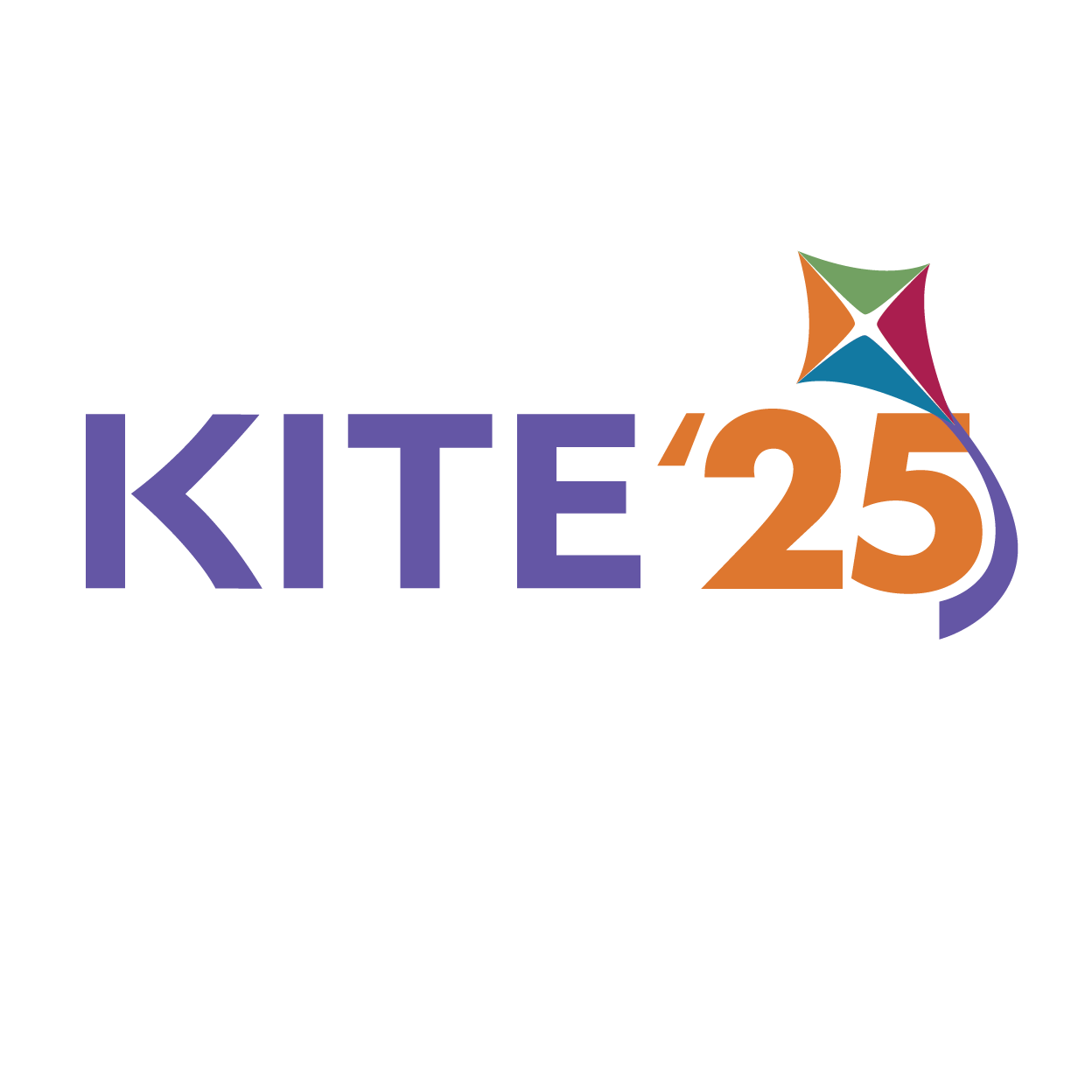
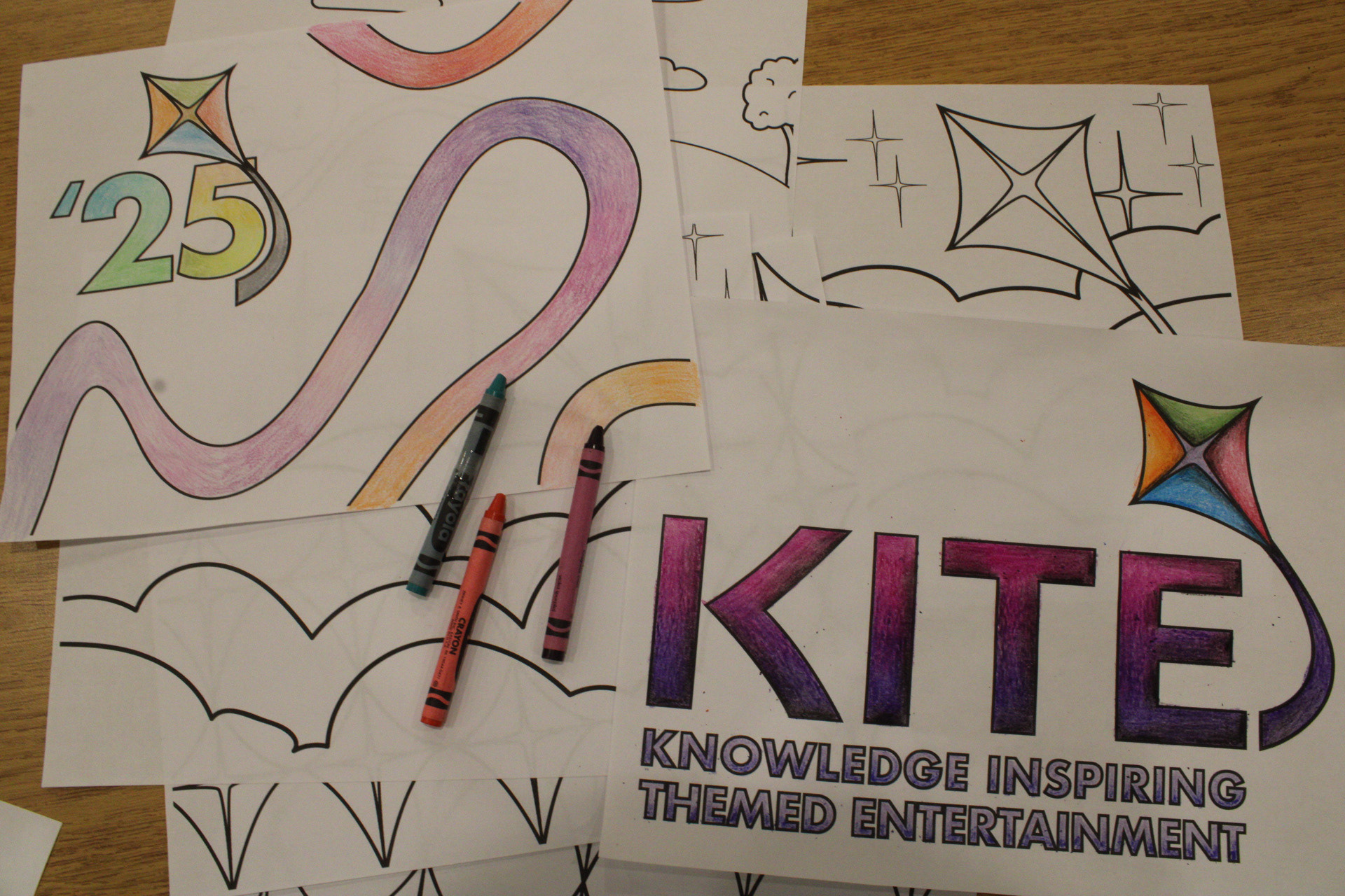
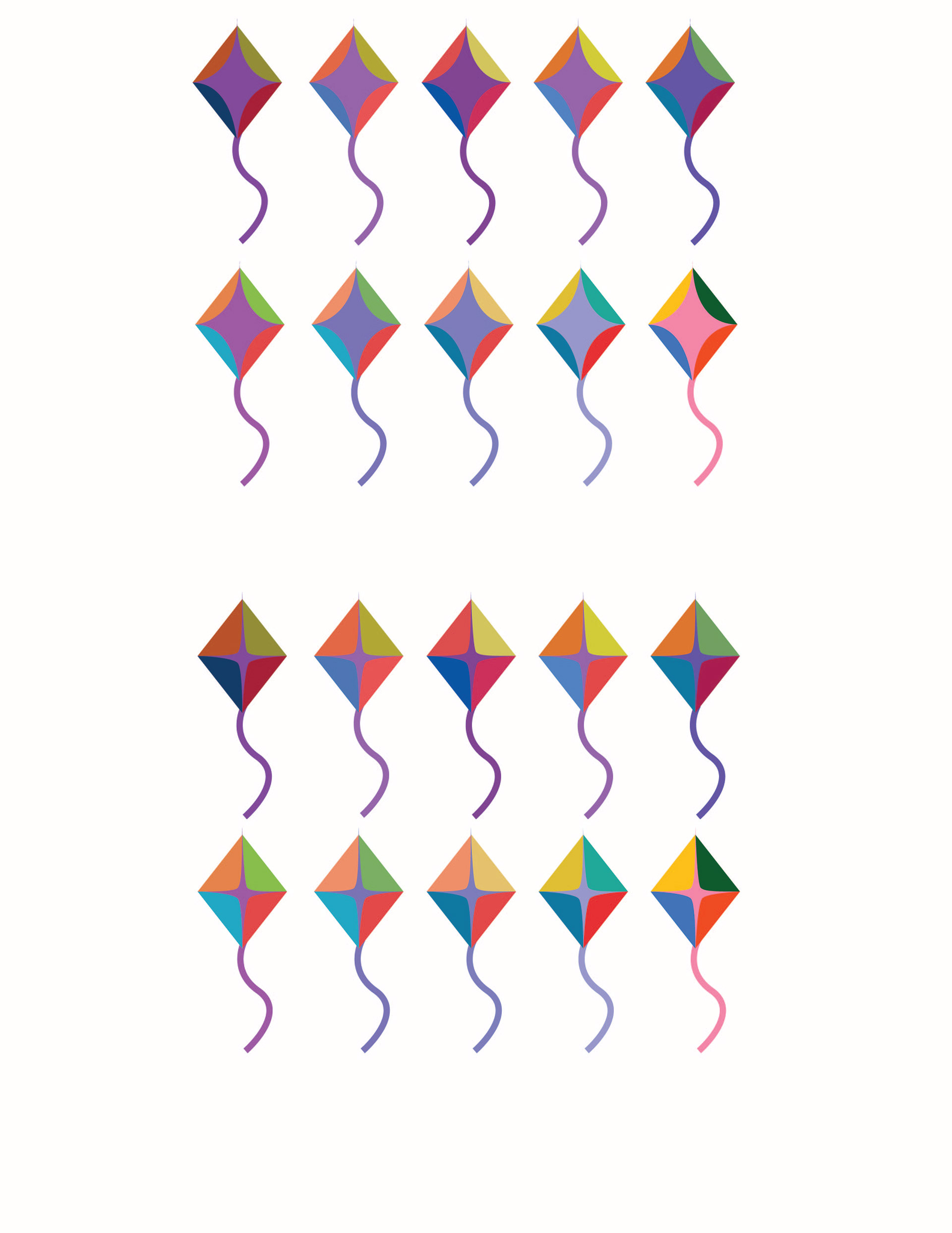
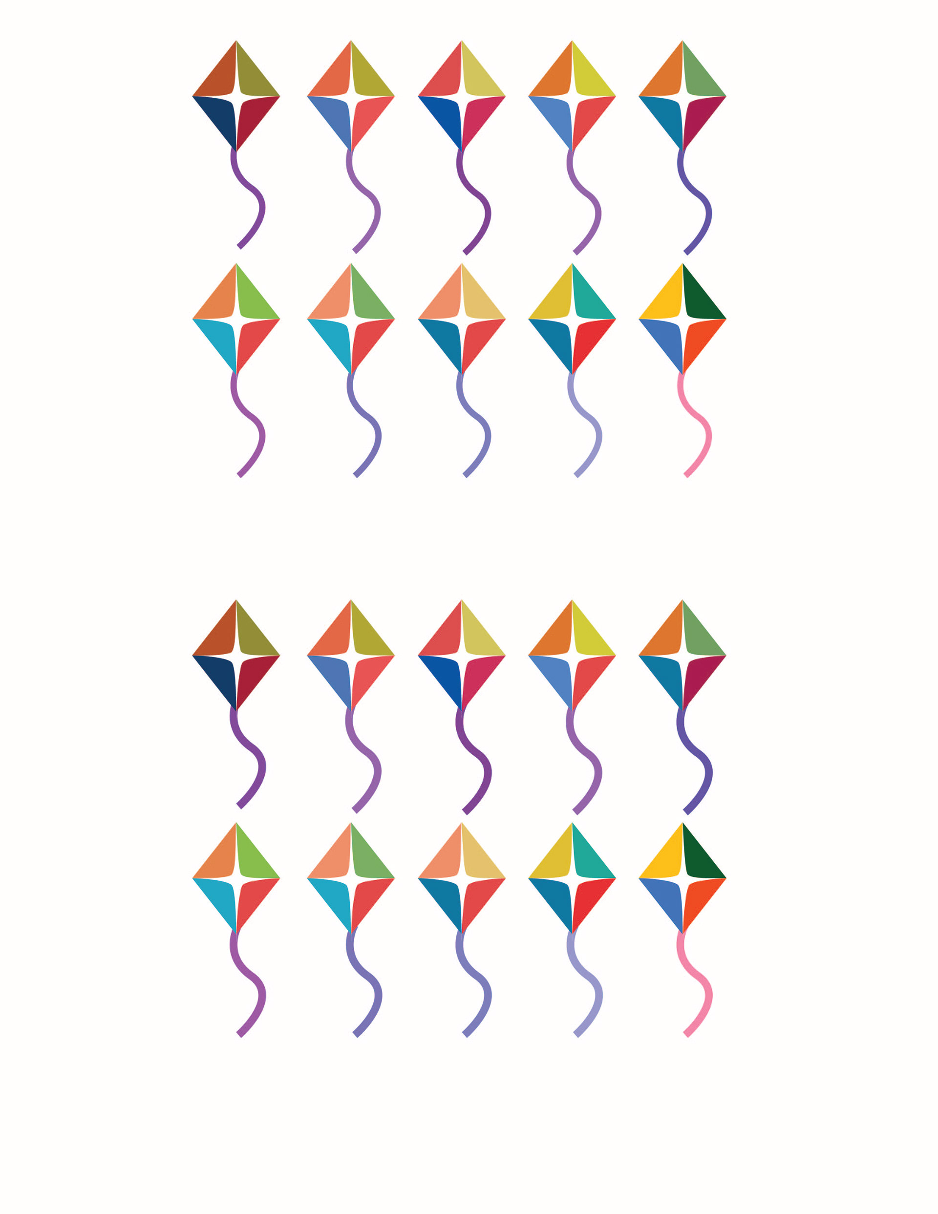
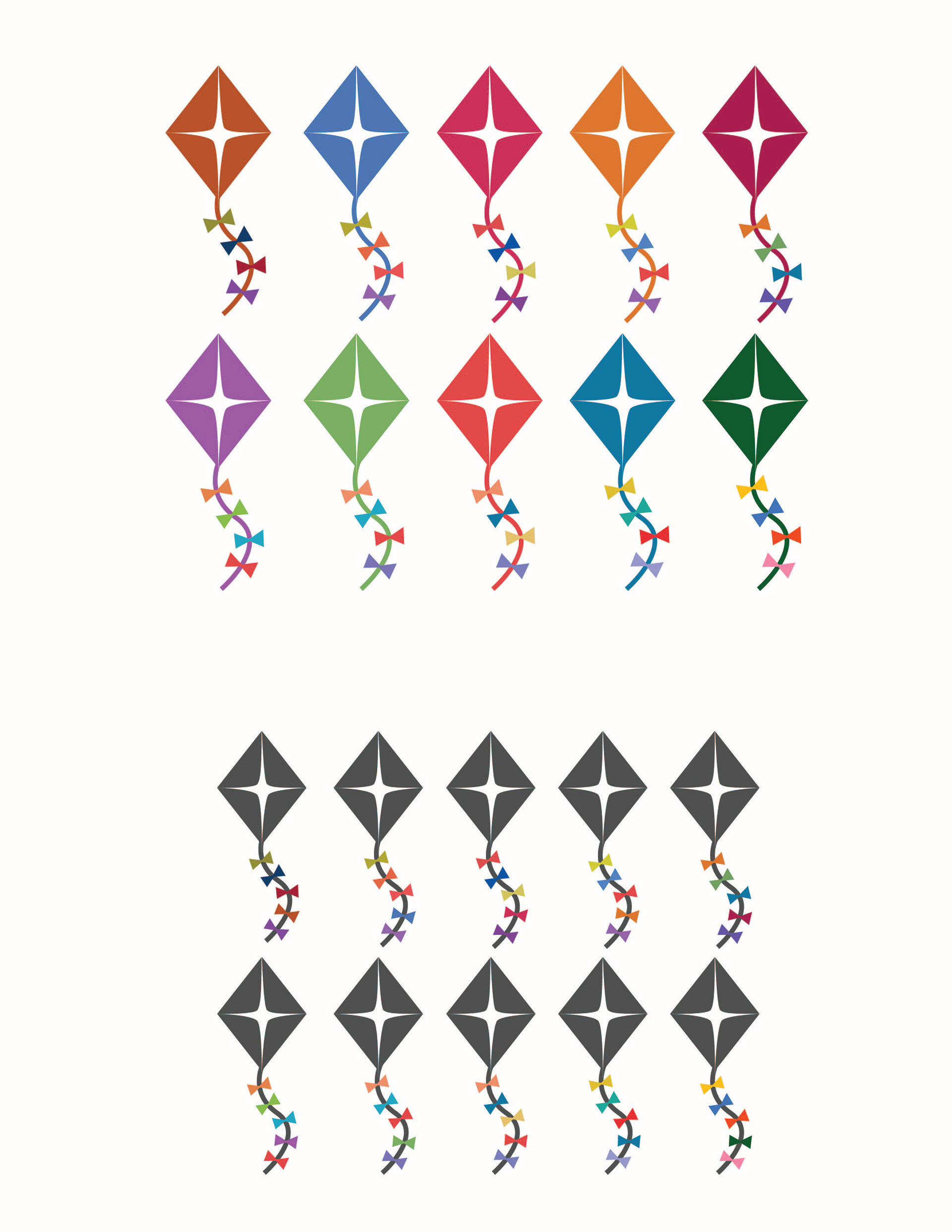
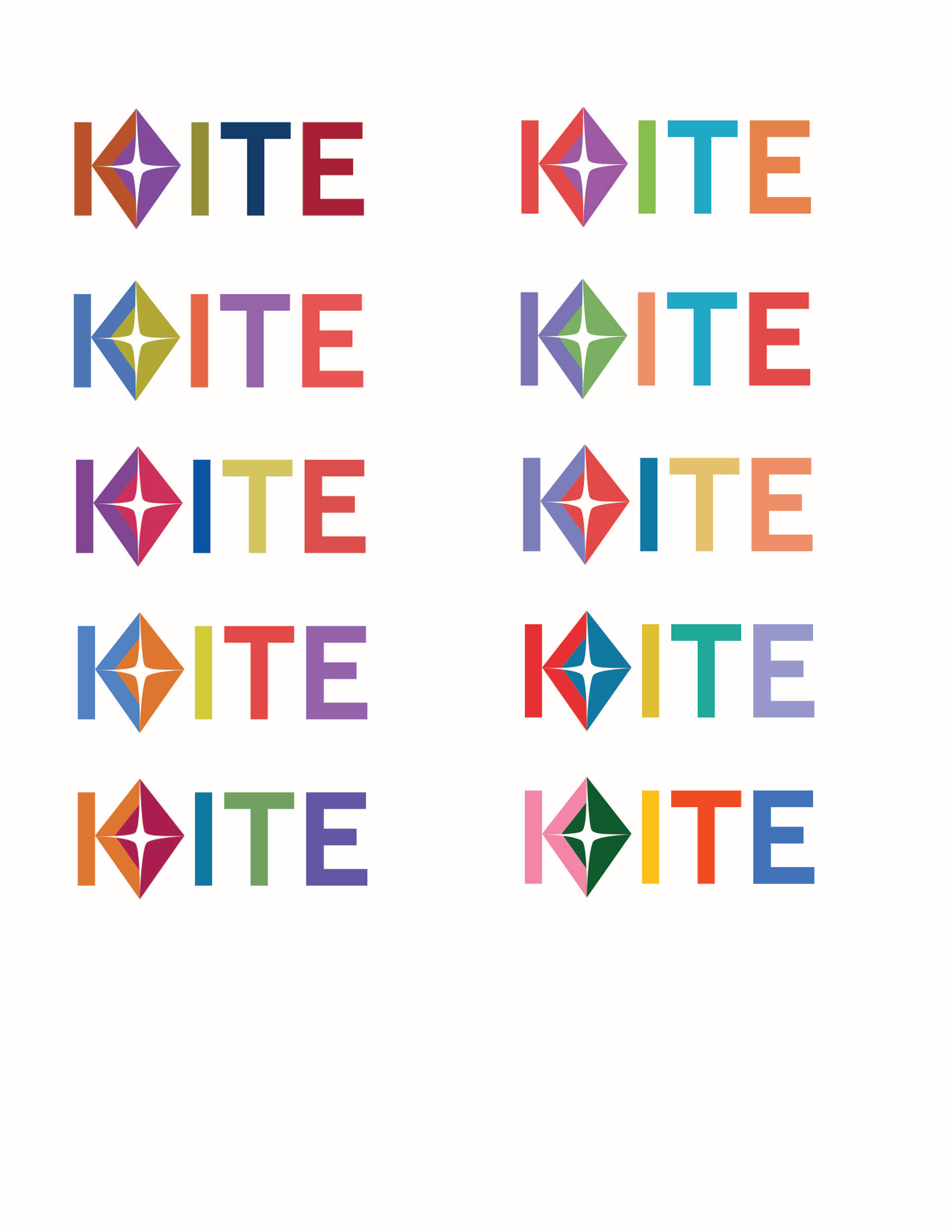
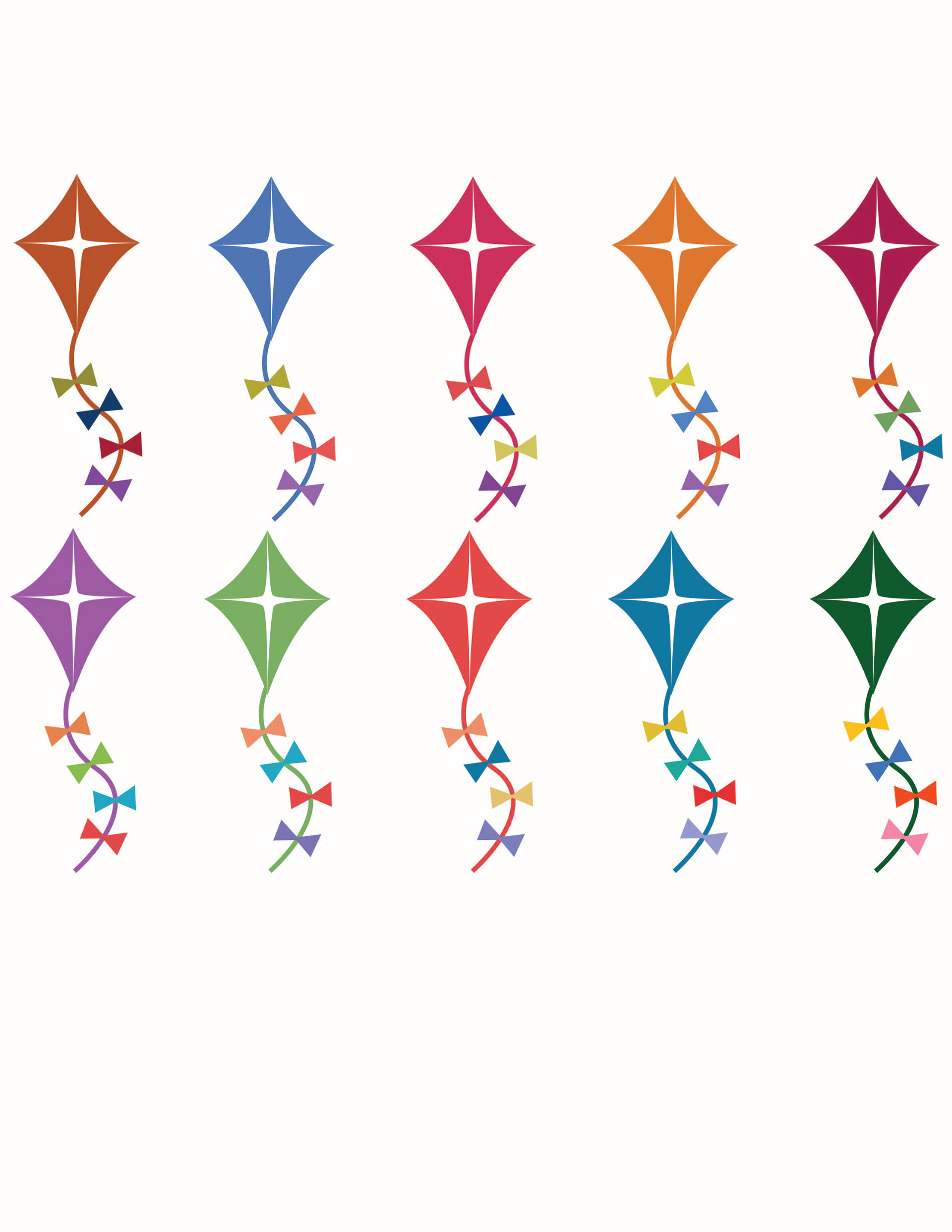
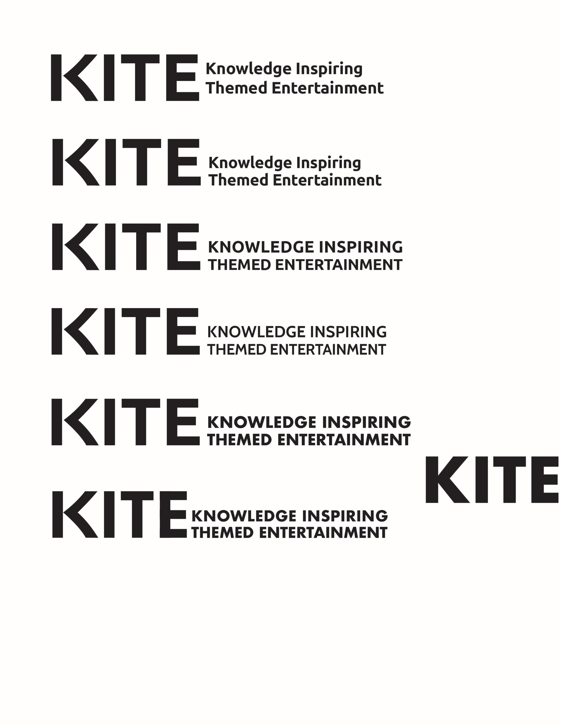
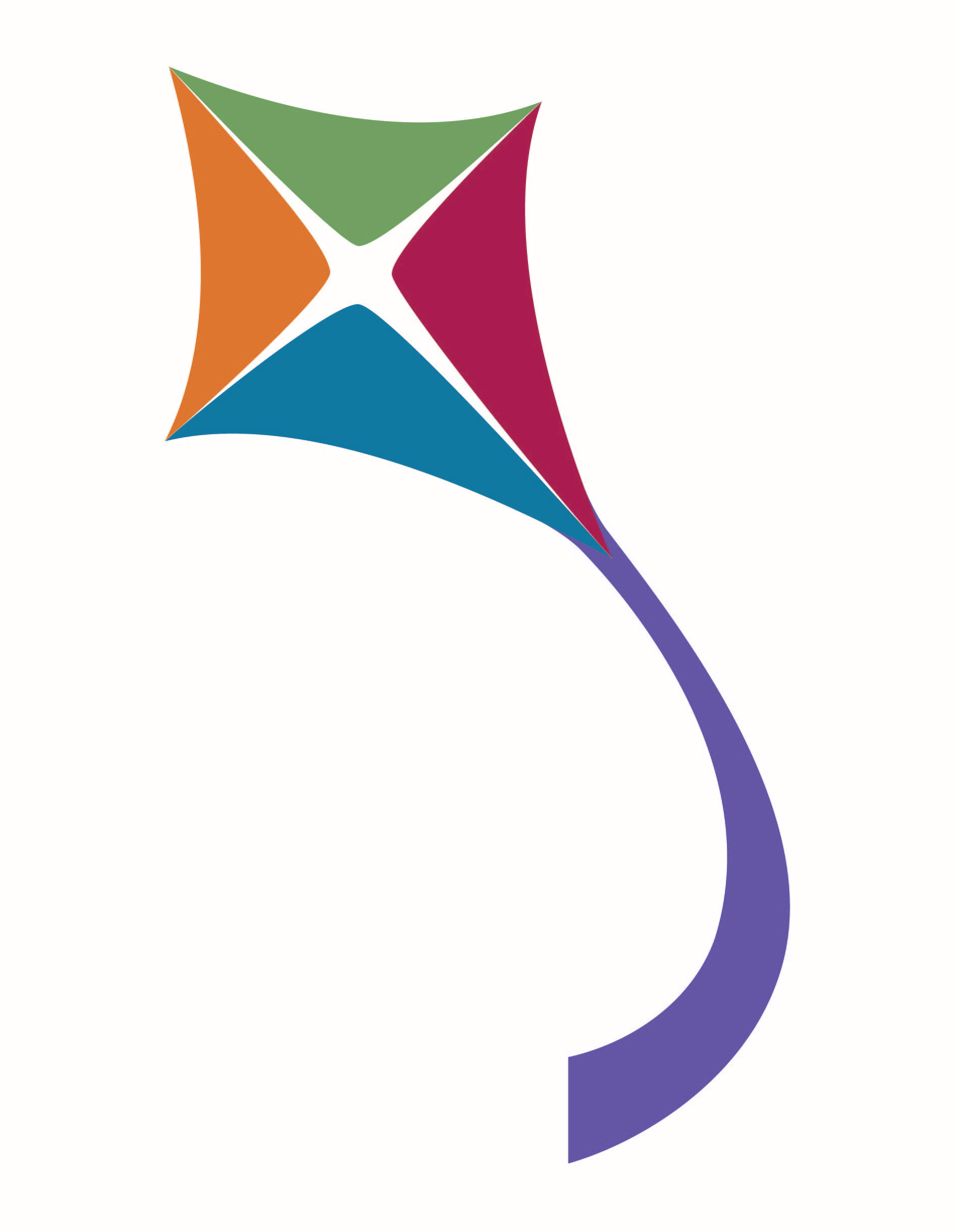
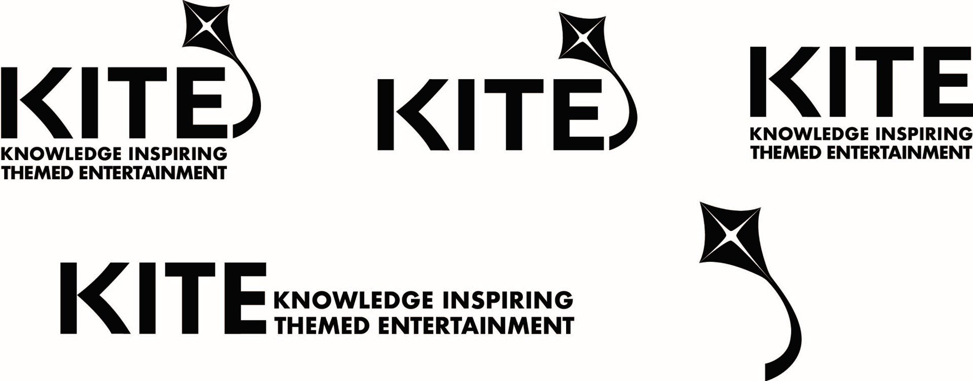
Three final options remained for our primary typeface. Each one would influence the look of our kite logo, as the shape of the kite would be molded after the K of whichever we chose. In the end, we pulled the K from the middle option shown above, but chose to use Futura as our primary typeface. Alongside choosing what typeface would best represent the conference, I also produced many variations of what our kite icon could look like in each of the color story options.(pictured below)
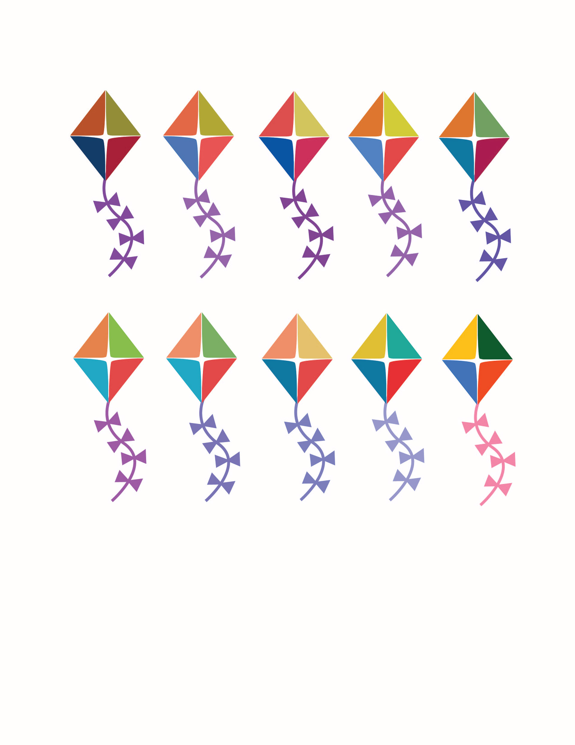
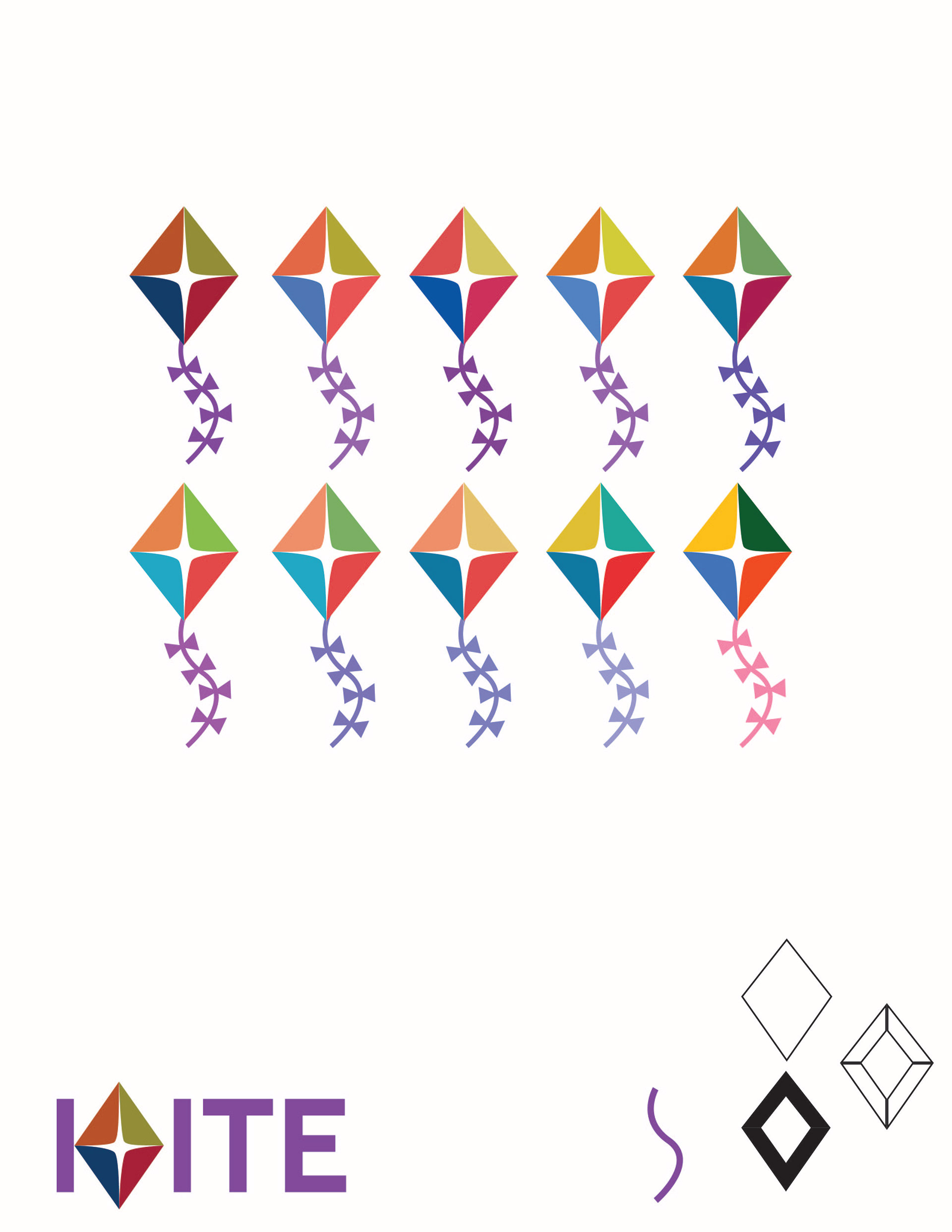
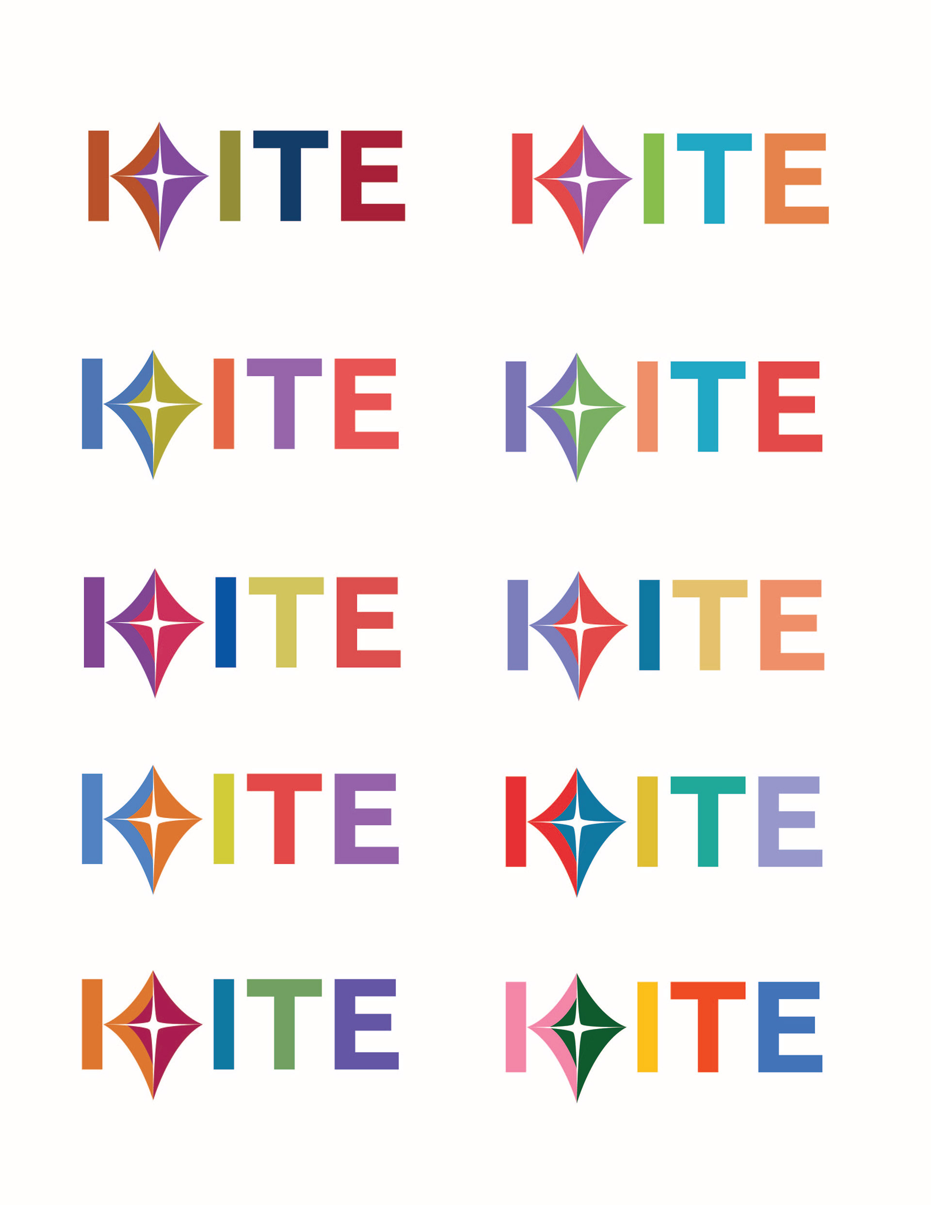
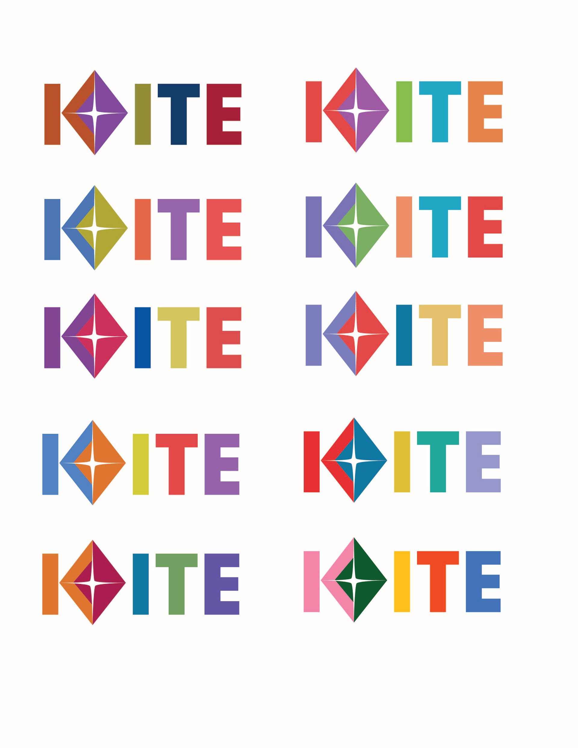
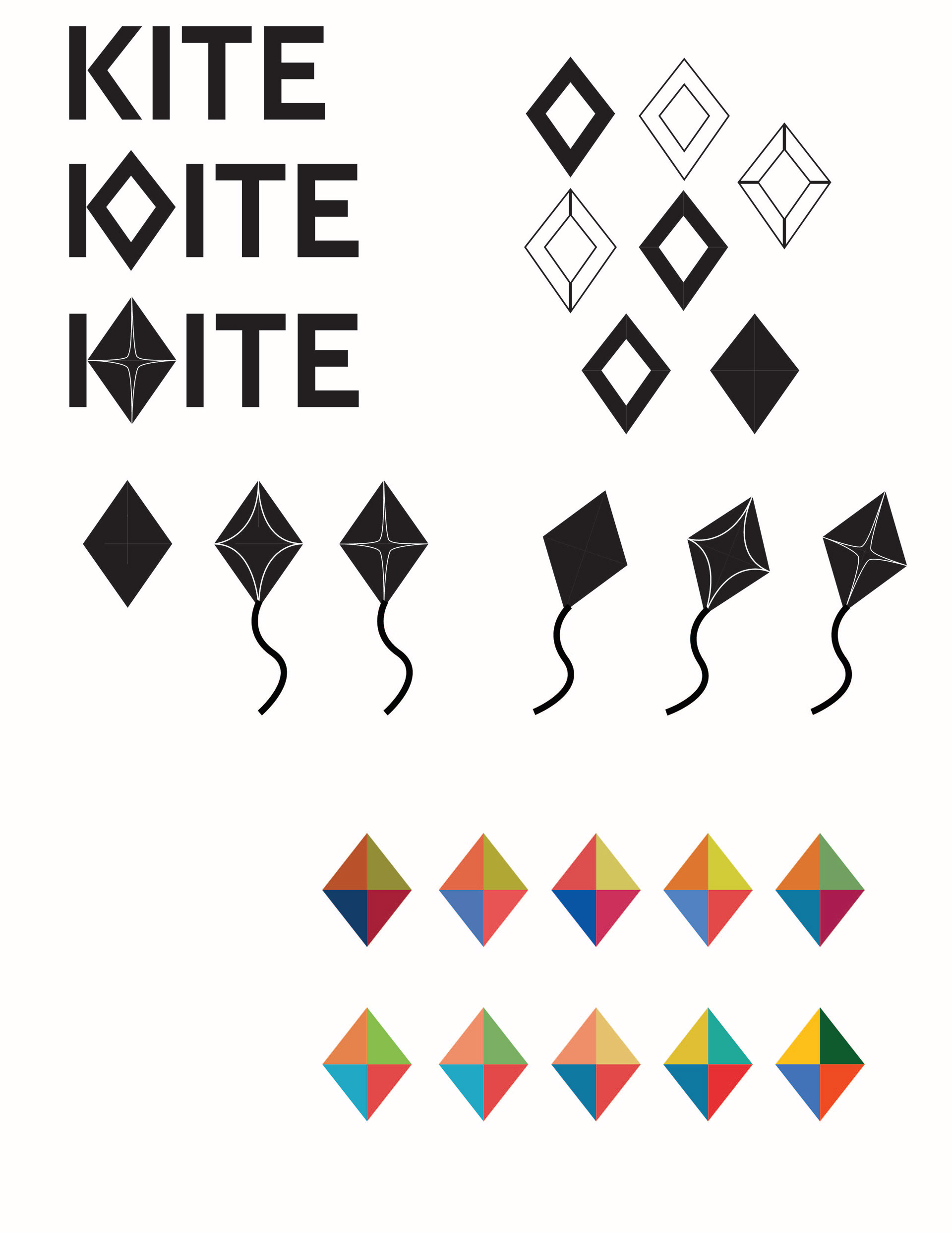
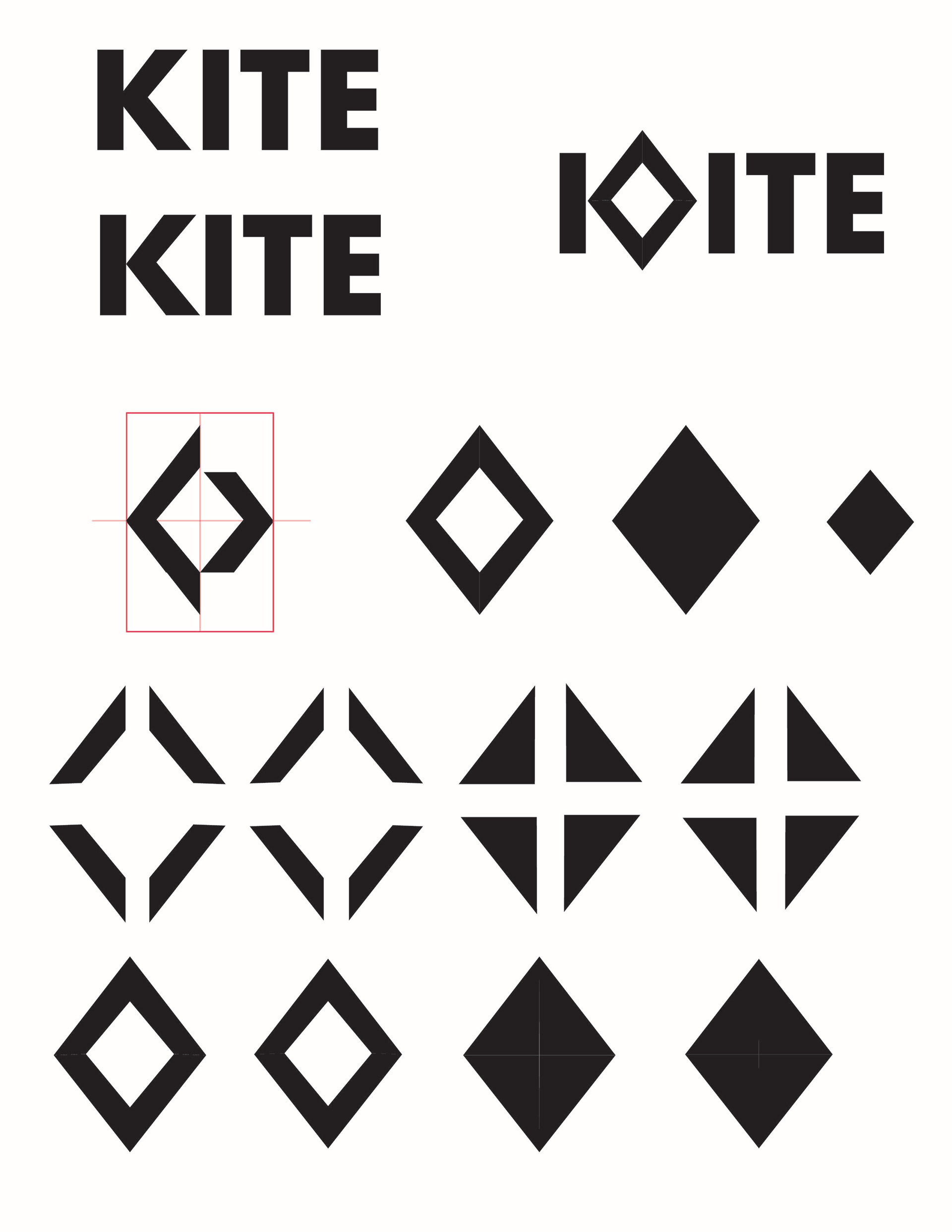
The color story, type, and shape of the kite were chosen. From there, I brainstormed what our finalized lettermark, wordmark, and icon would look like.
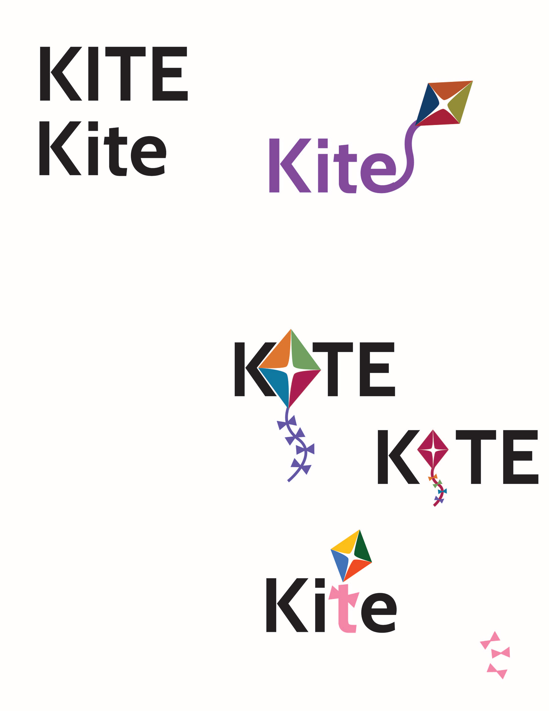
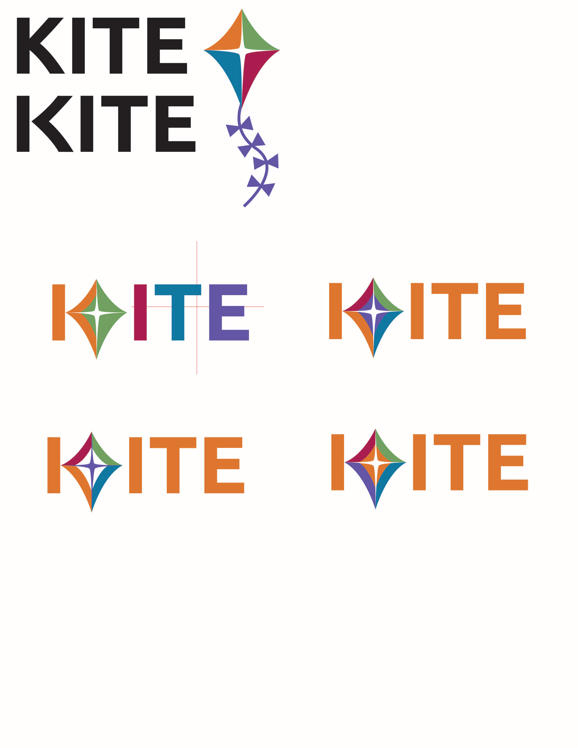
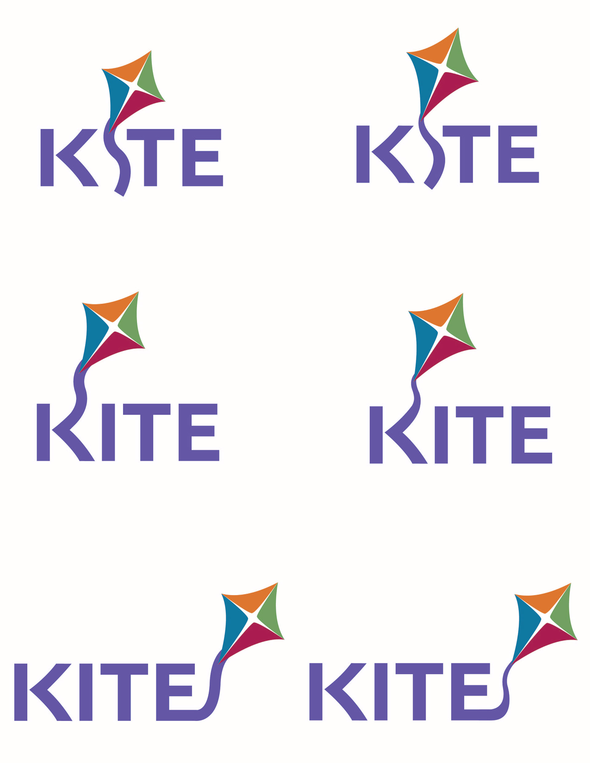
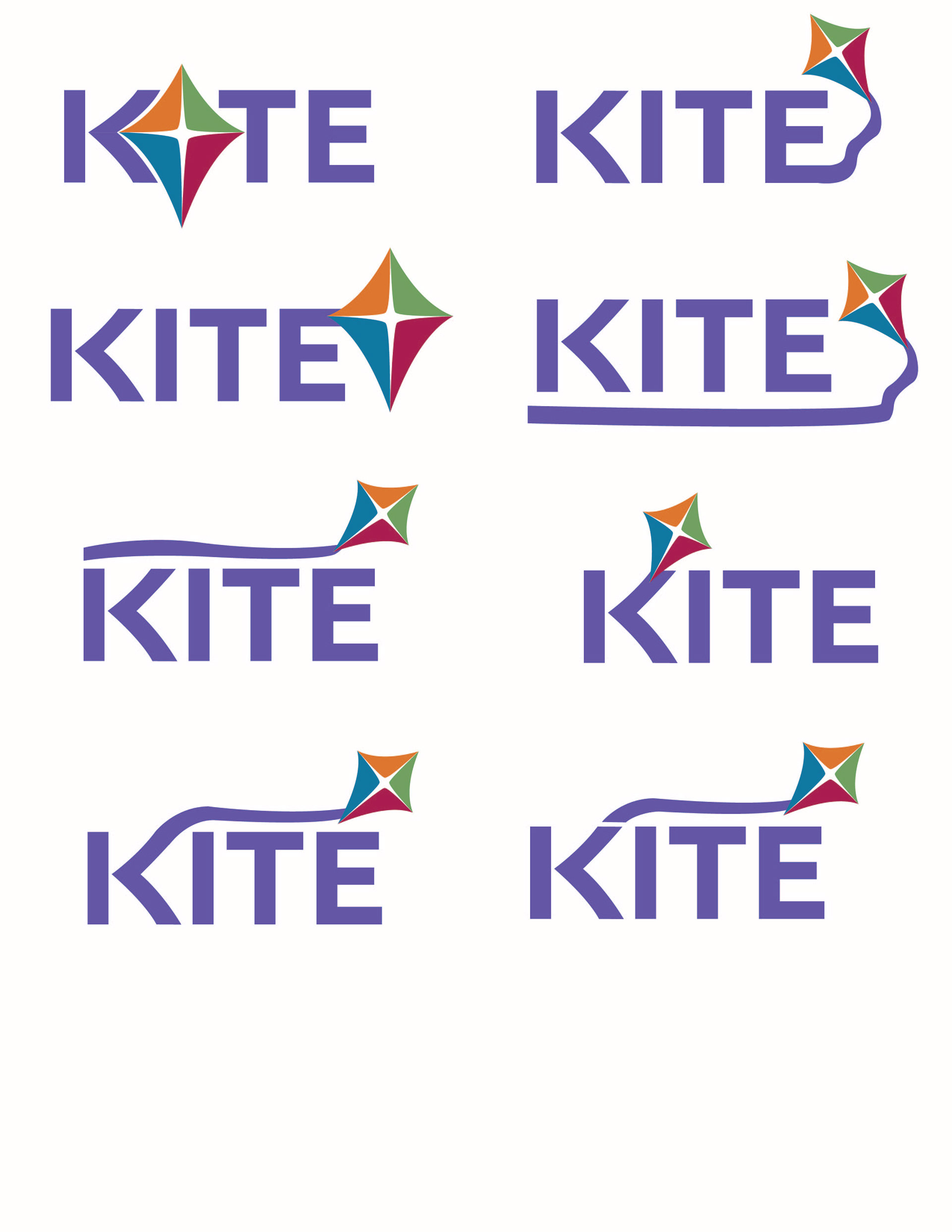
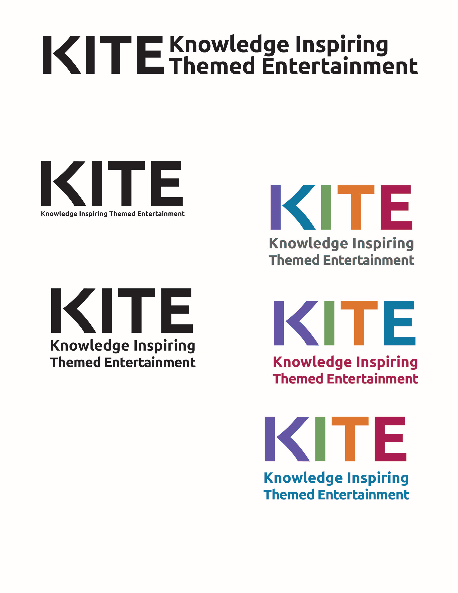
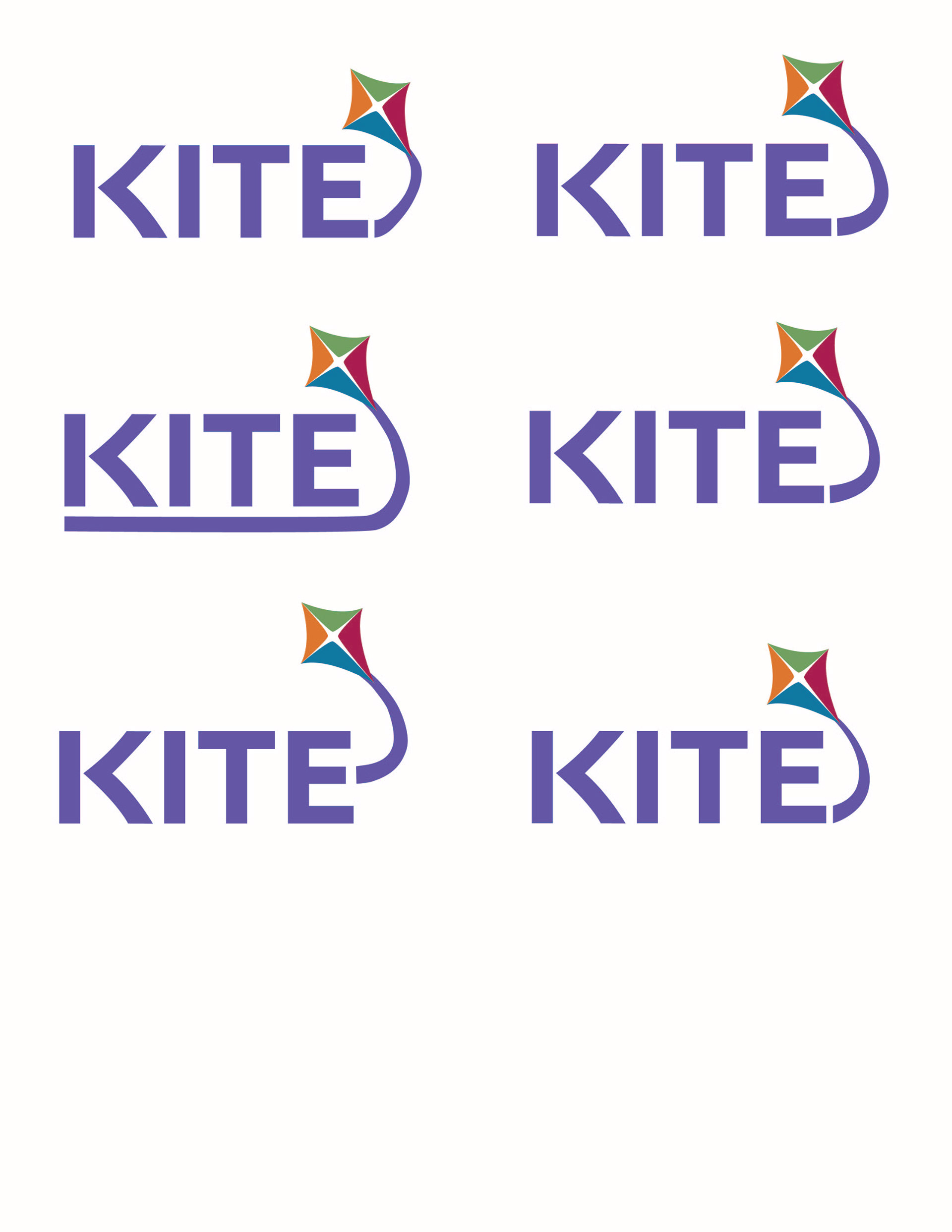
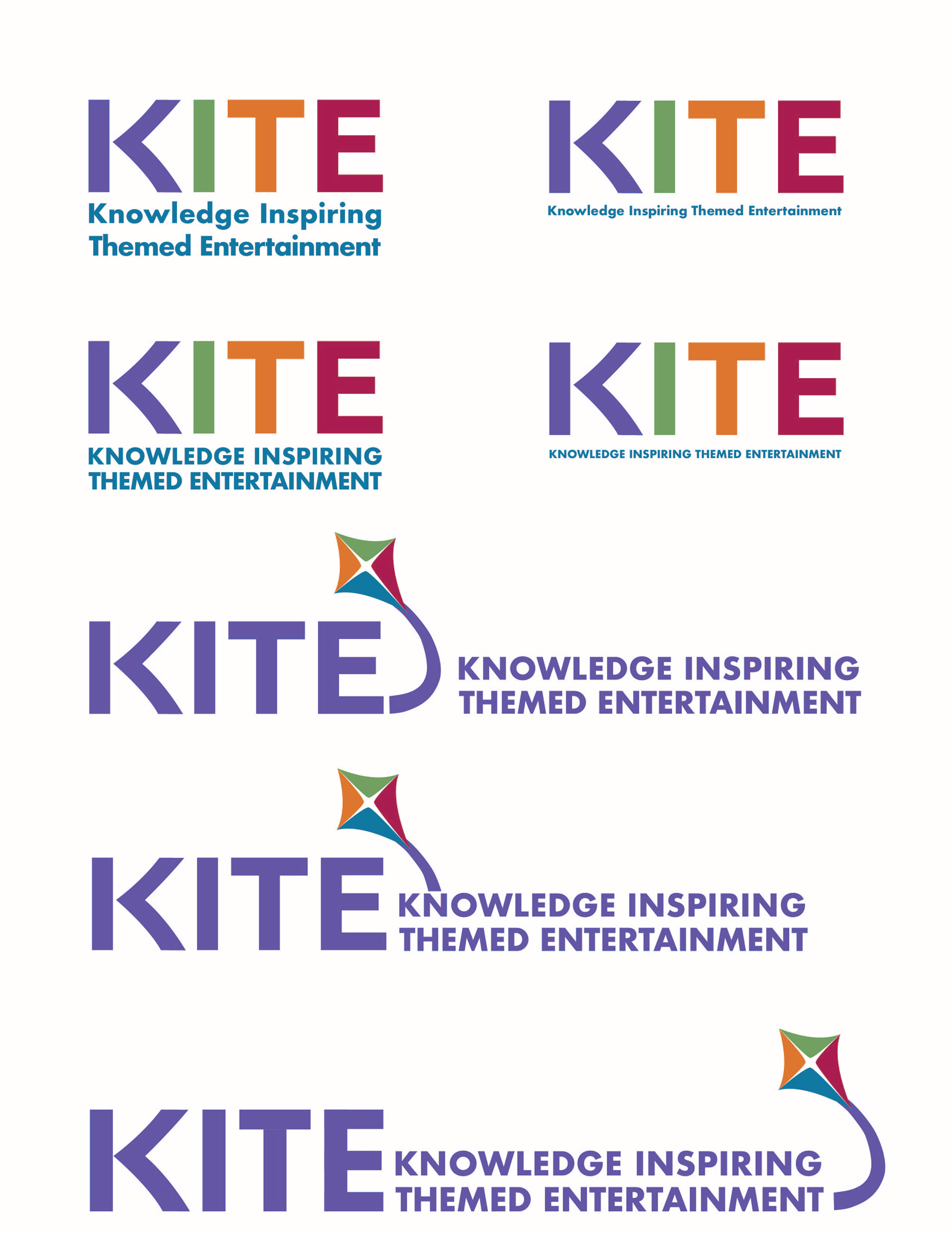
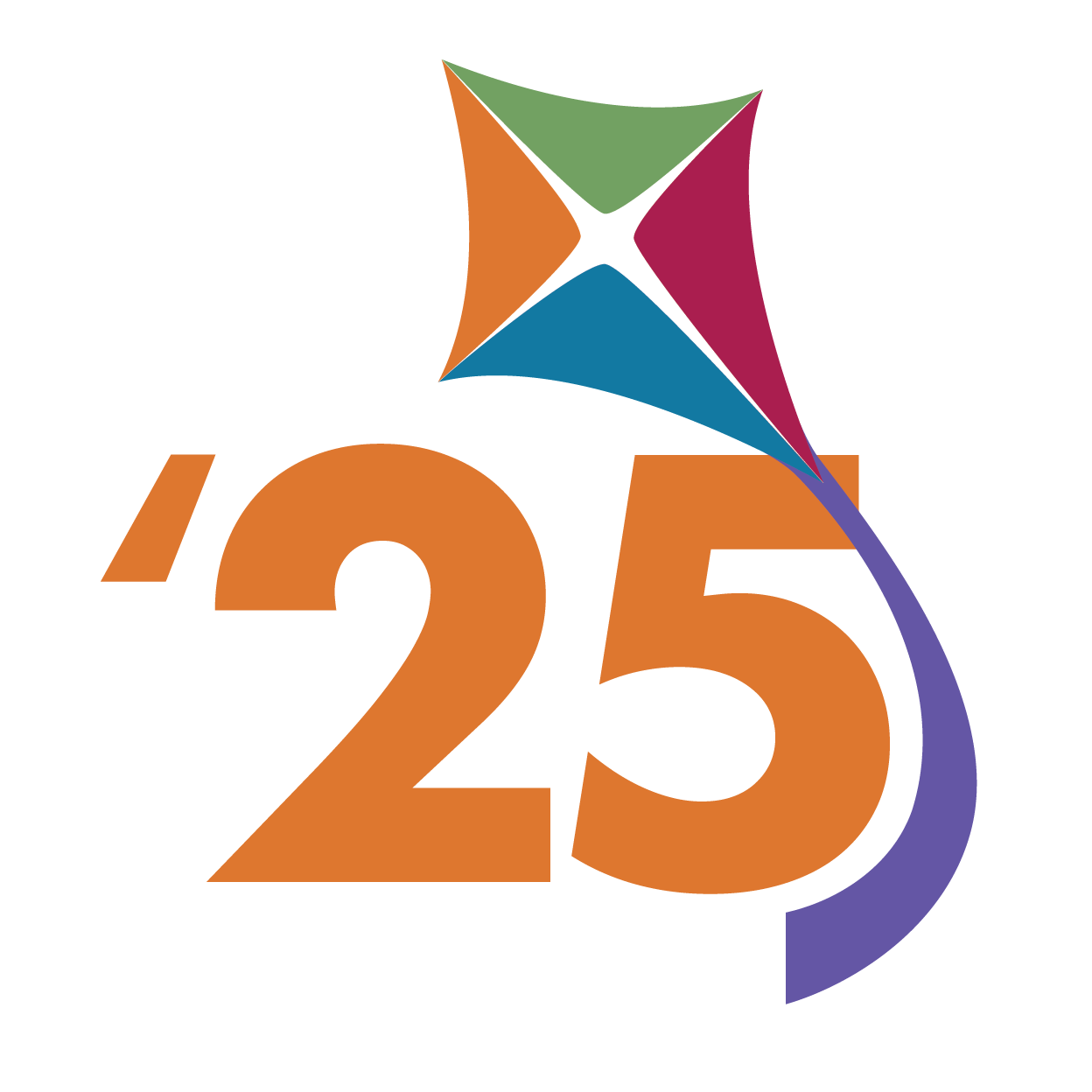
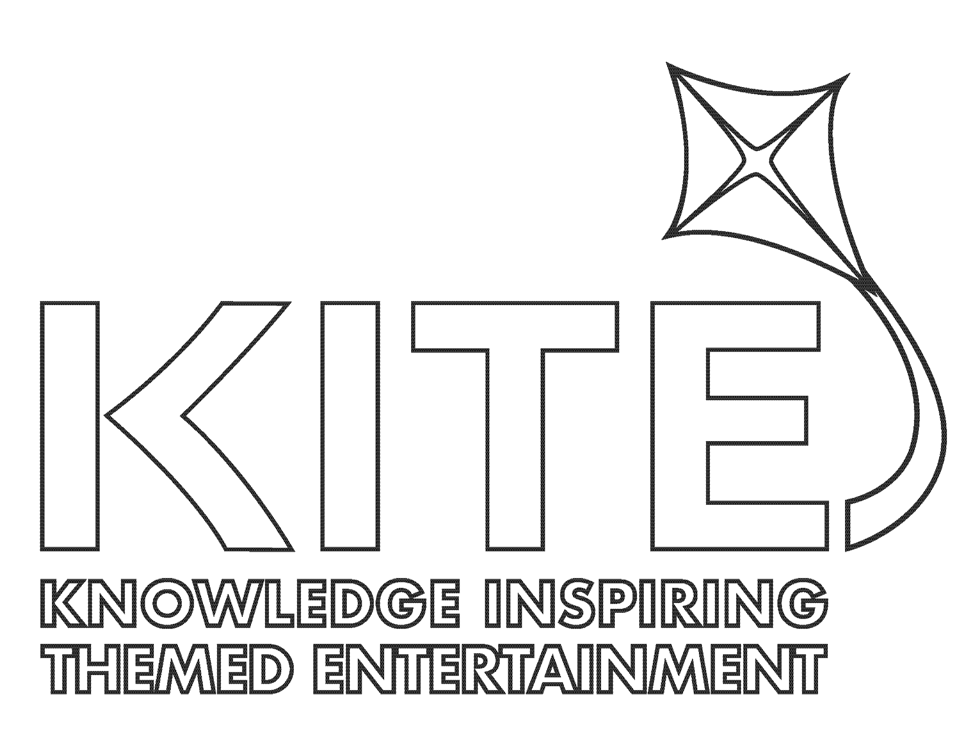
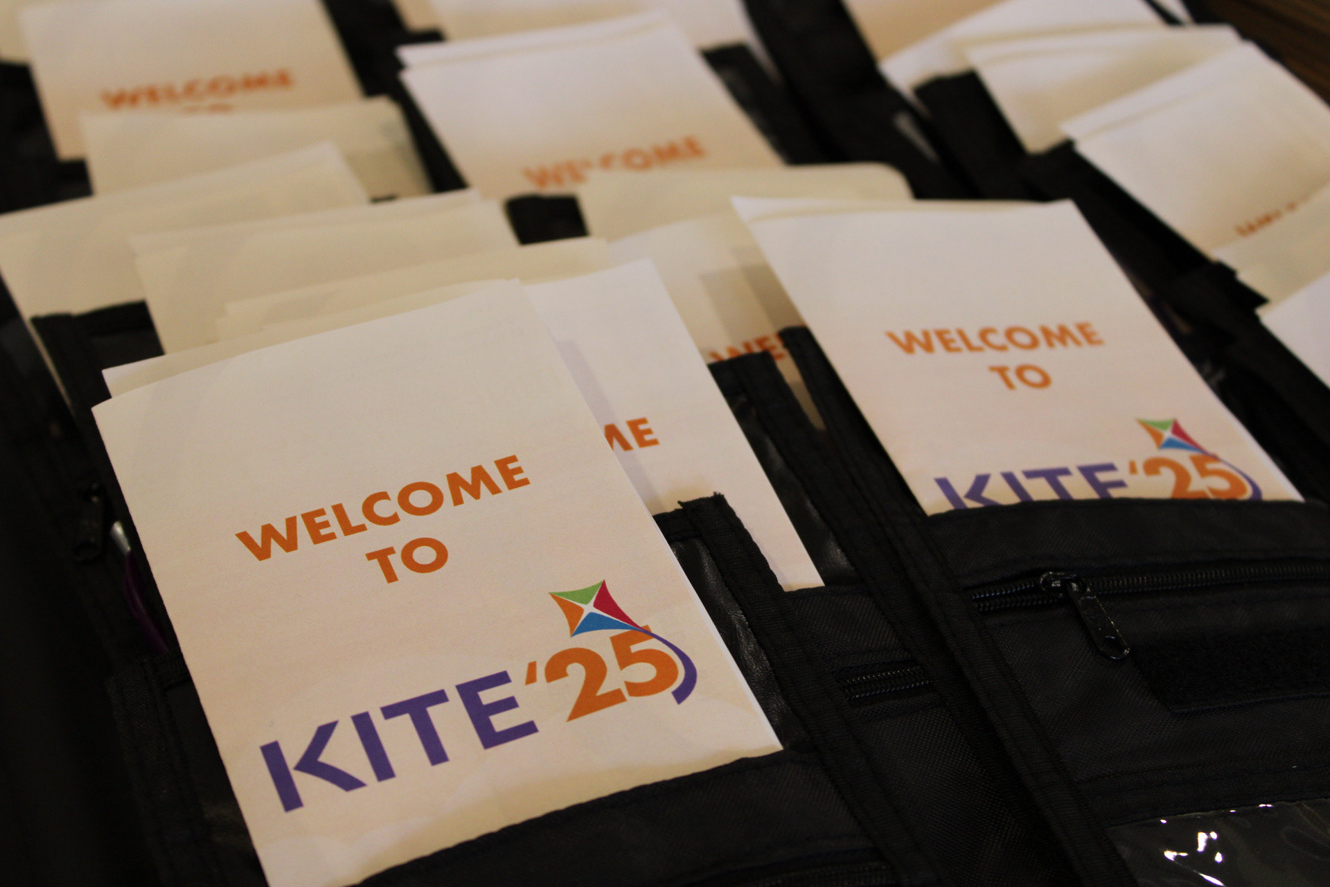
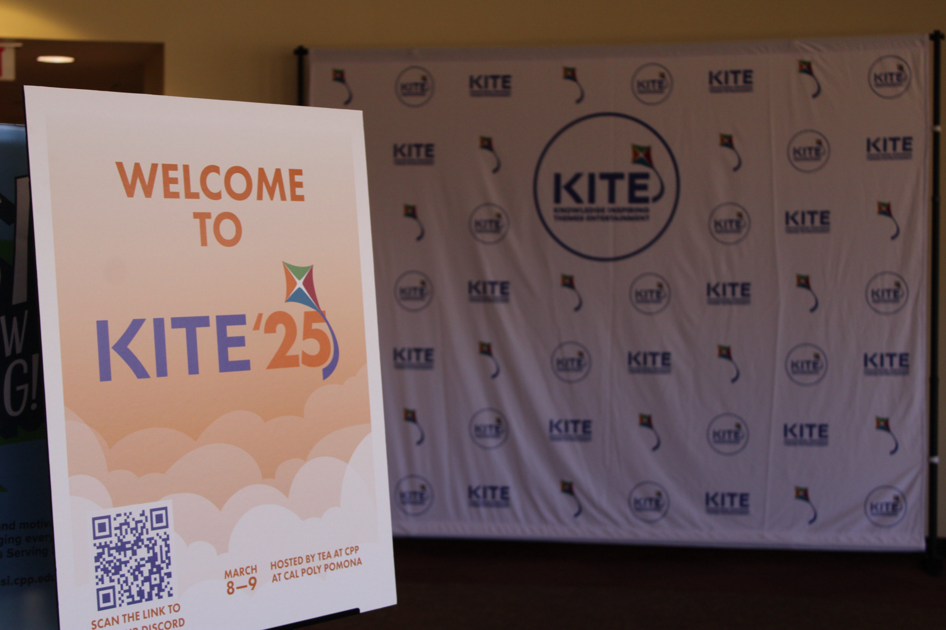
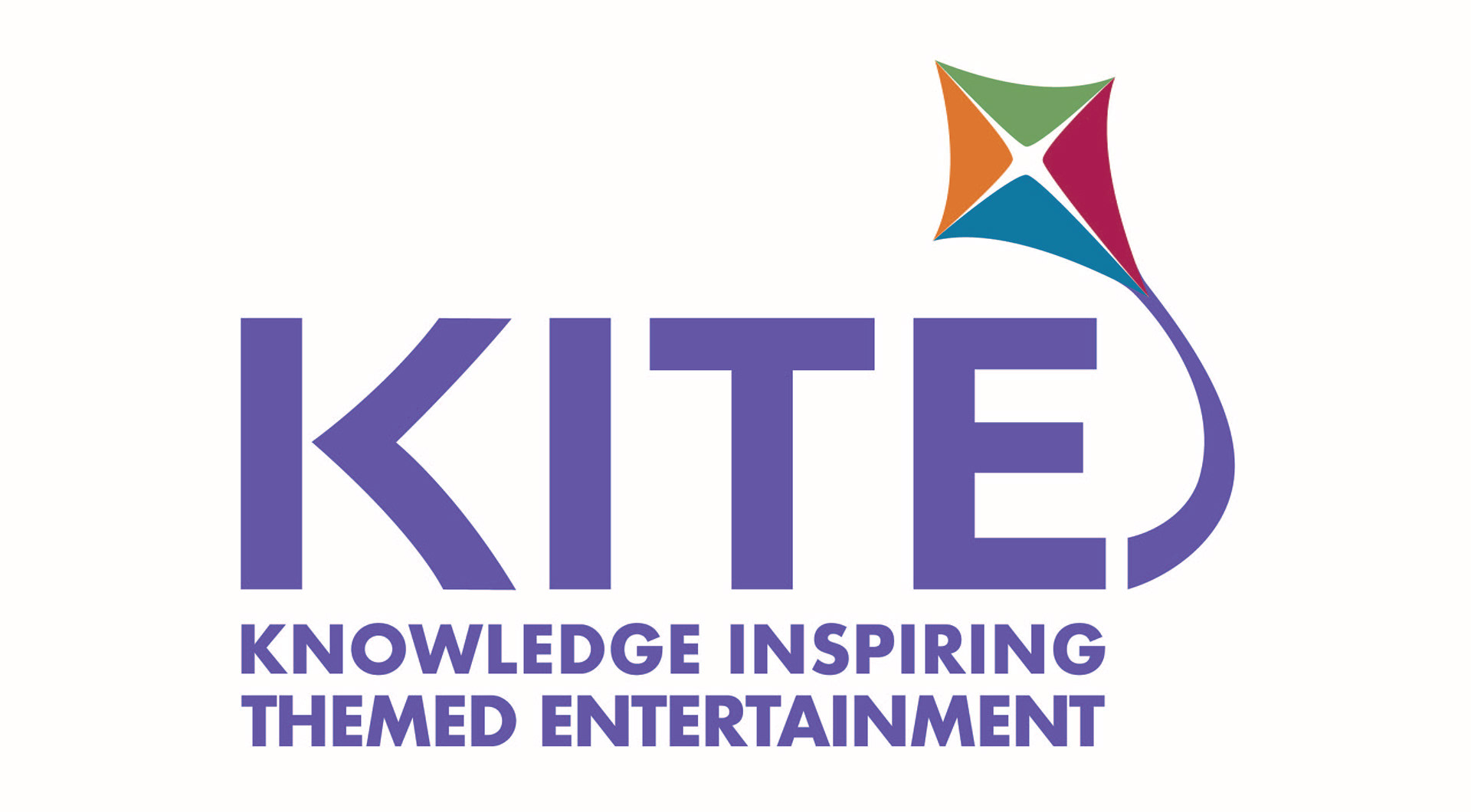
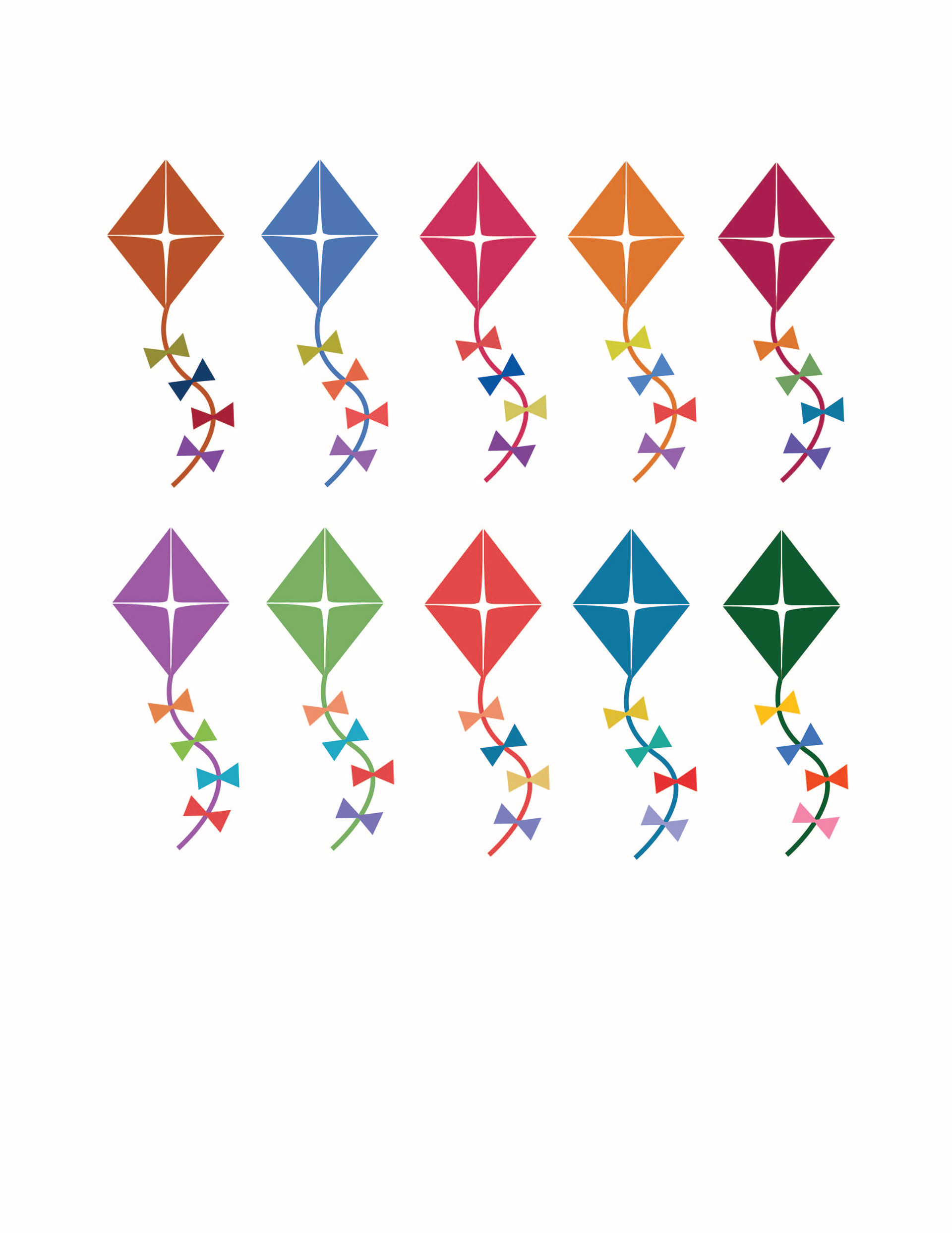
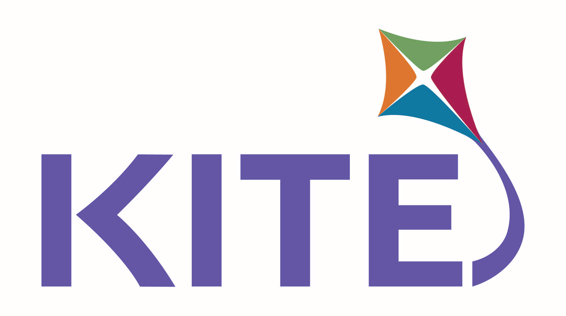
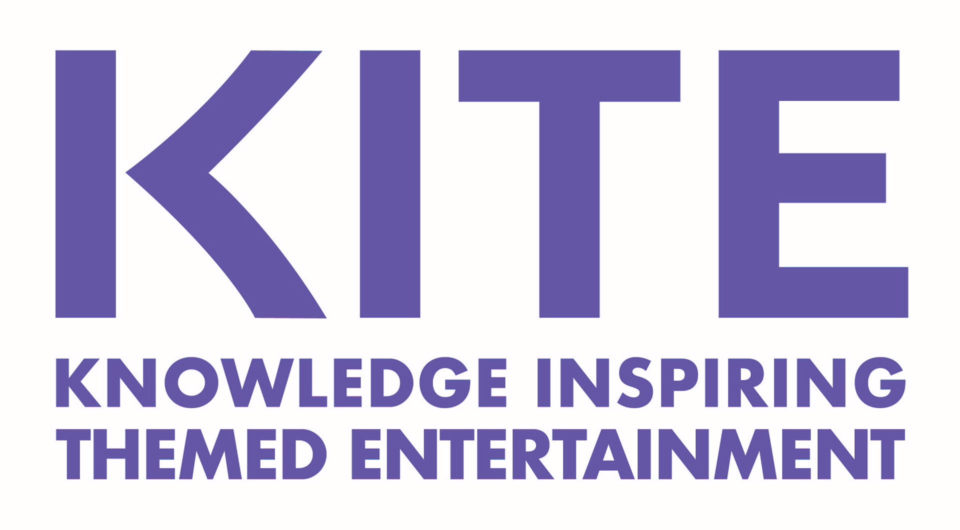
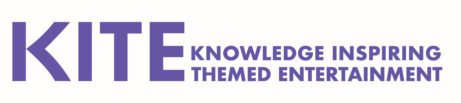
And here we have it, our finalized branding suite! In the end we chose Futura Bold to be the main representative of the branding. However, the shape of the kite icon and the arm and leg of the 'k' character were pulled from another type option we had explored. The characters of 'KITE' were each modified to match the weight of this part of the K; the ears of the T and the legs of the E were also modified to maintain a cohesive look for our new word mark. Adding more weight to the characters added strength and stability to our logo. This was important for us to convey because we were not an established conference. Bringing in the curvature to the K and the icon added balance to these changes through a sense of playfulness and whimsy.
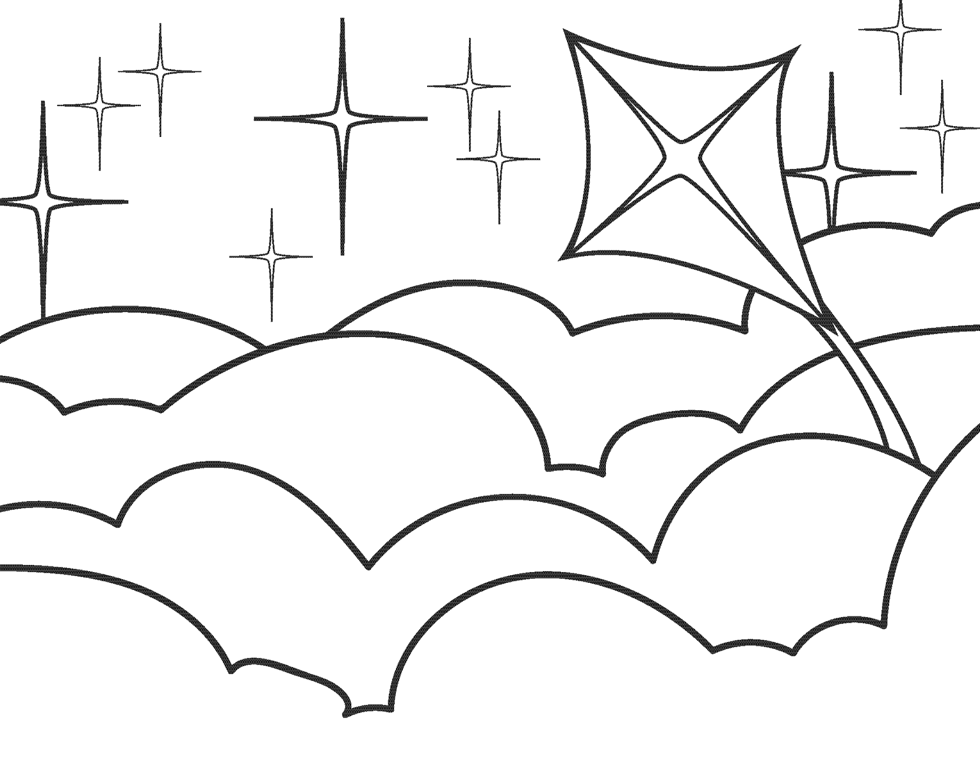
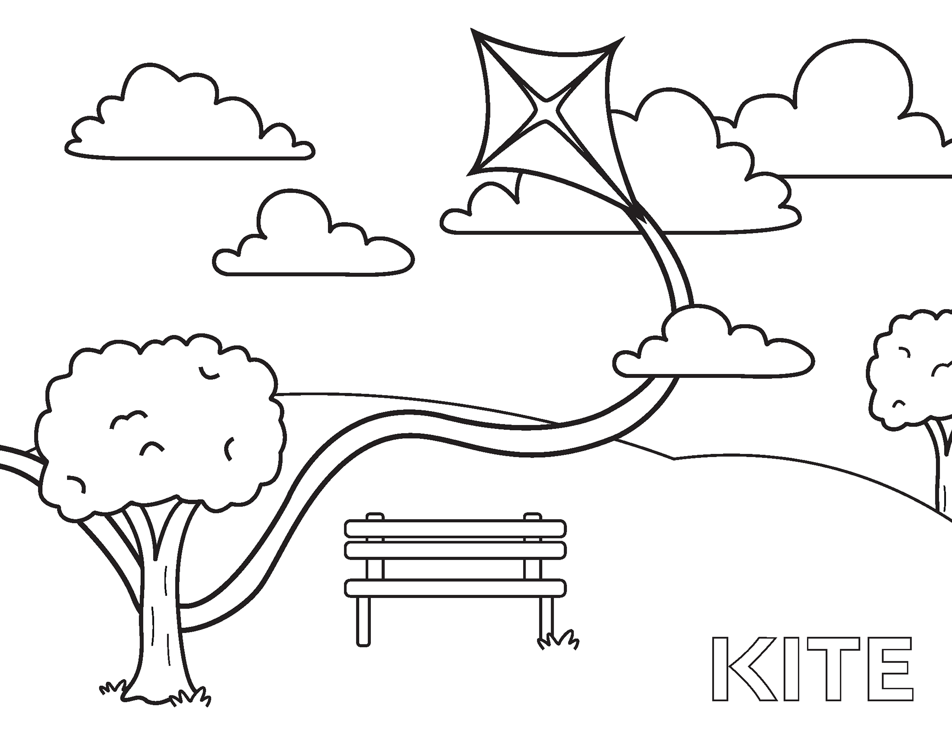
Just think of all the applications...

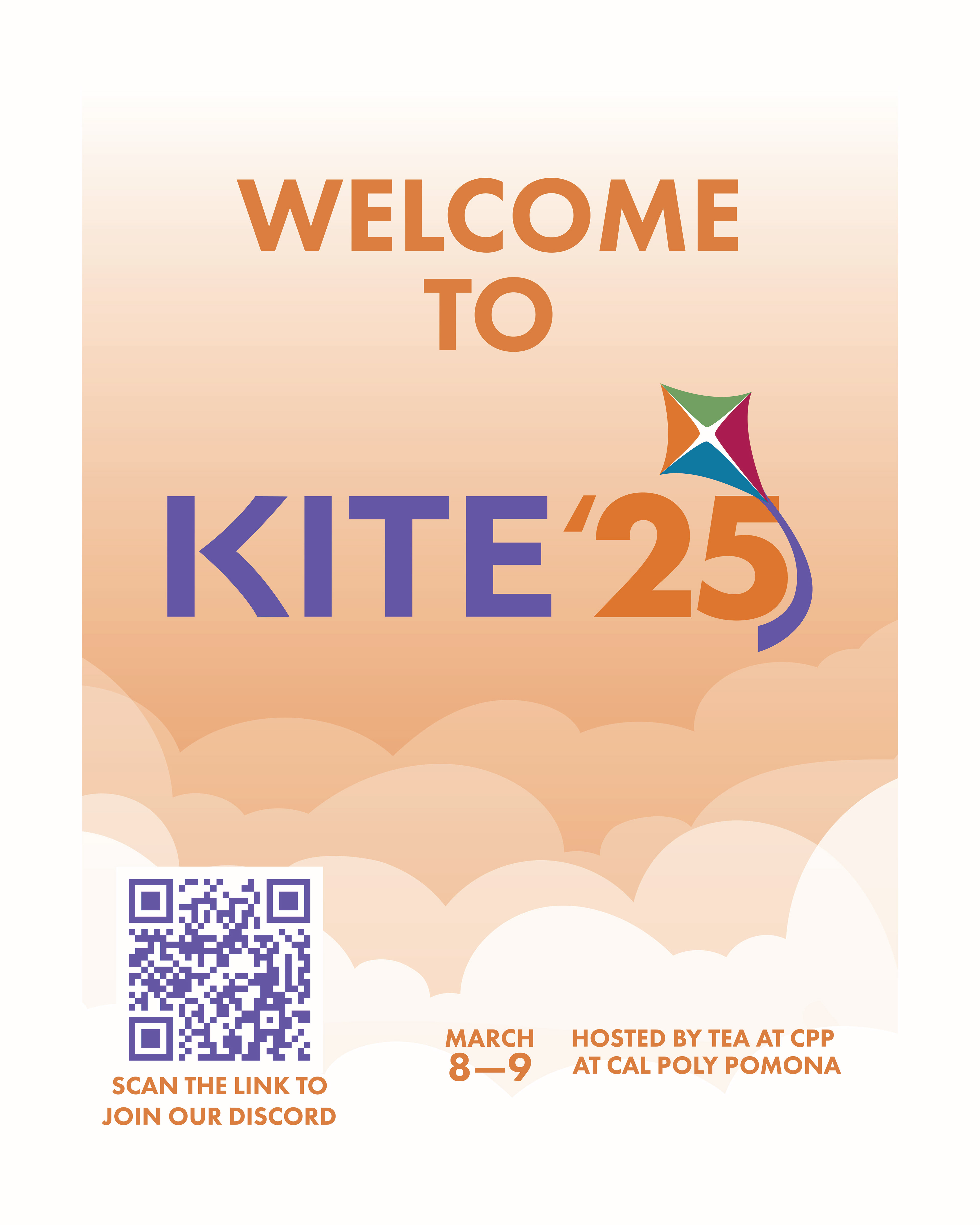
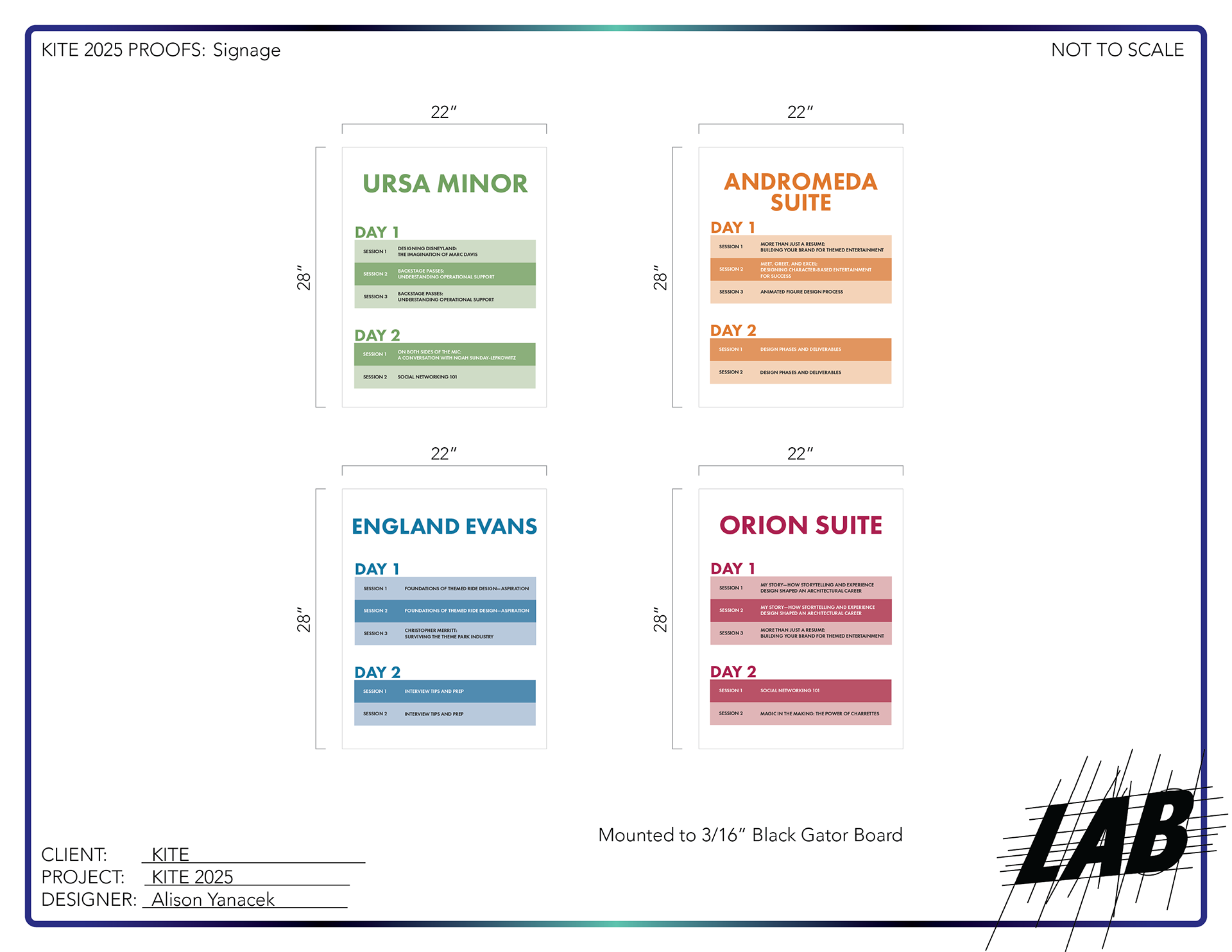
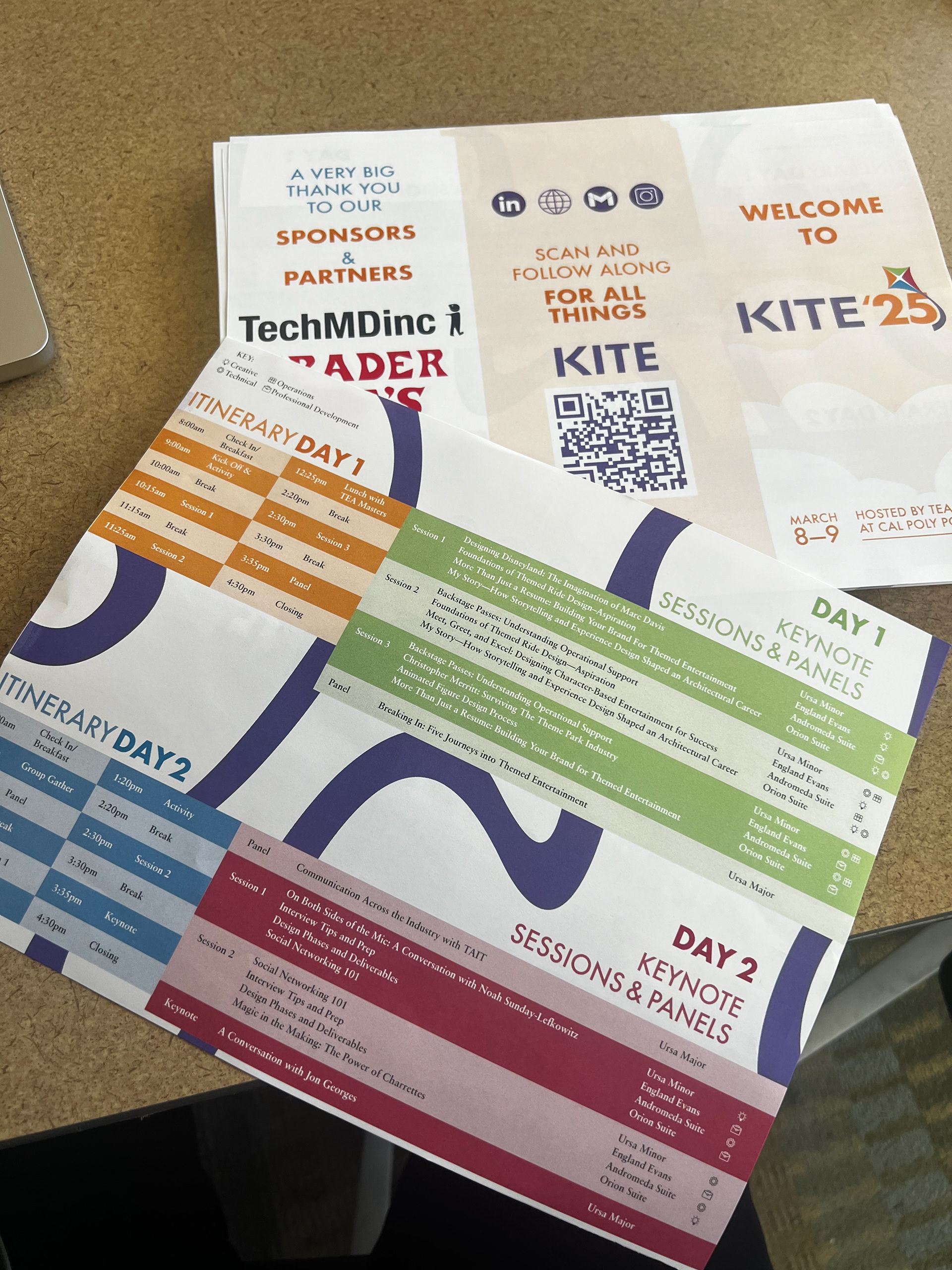
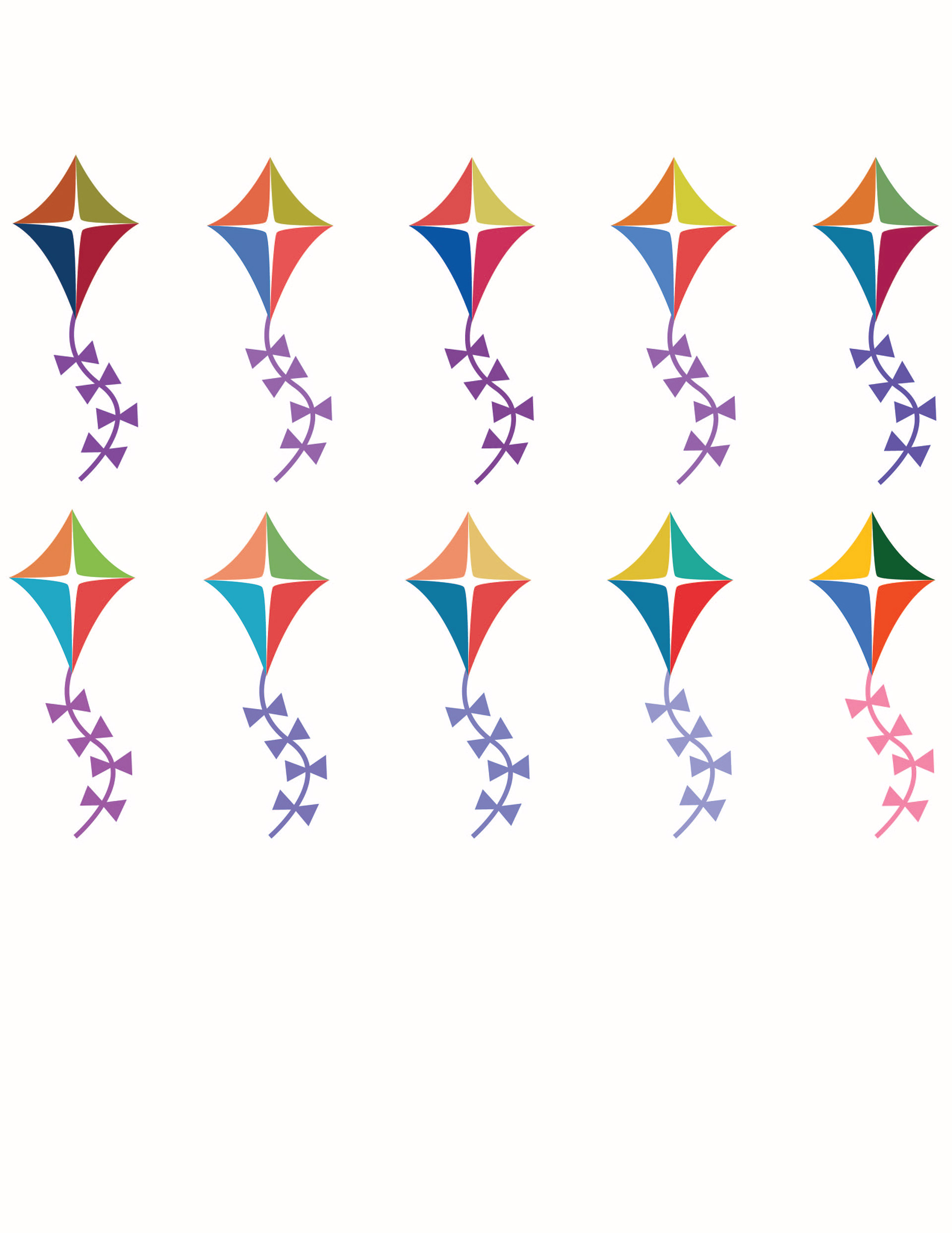
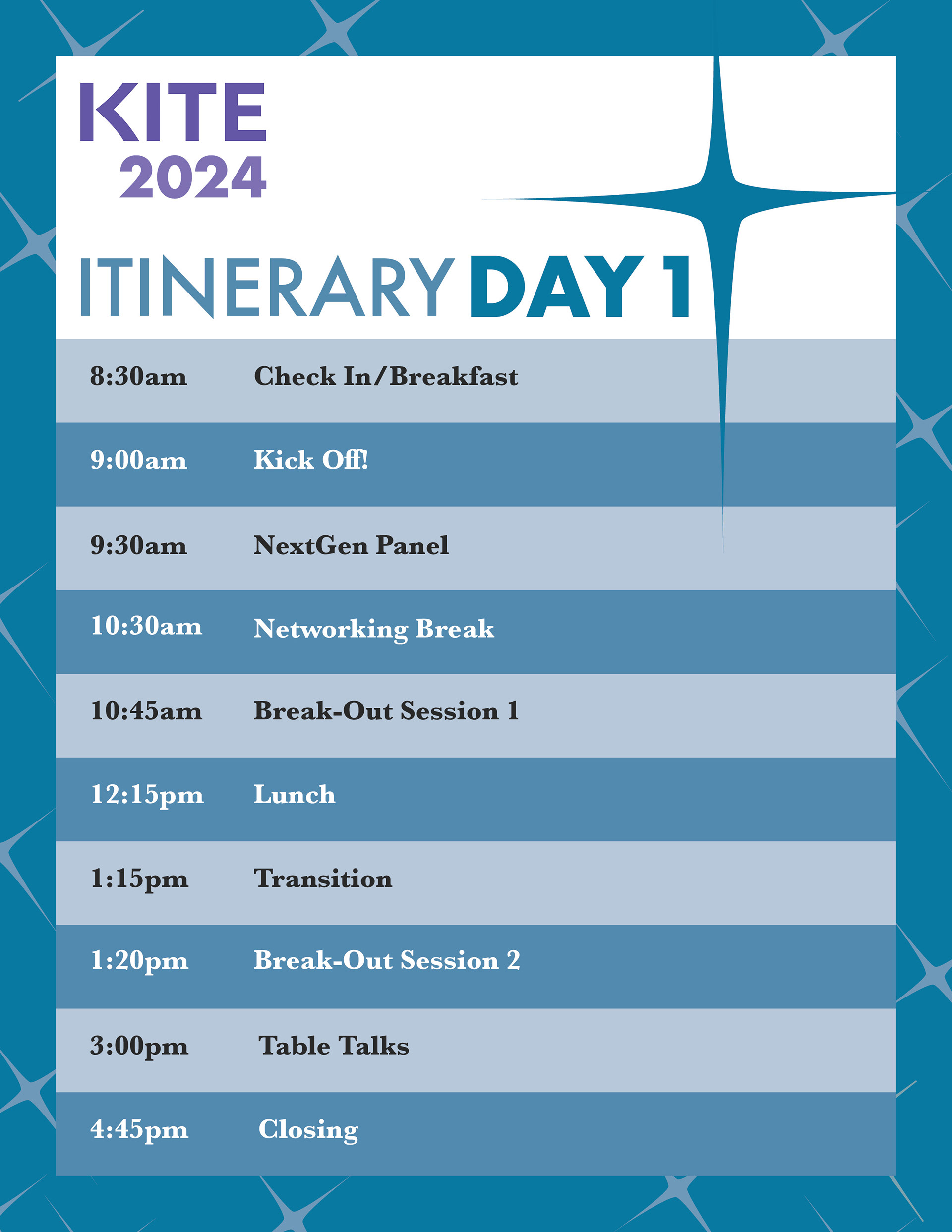
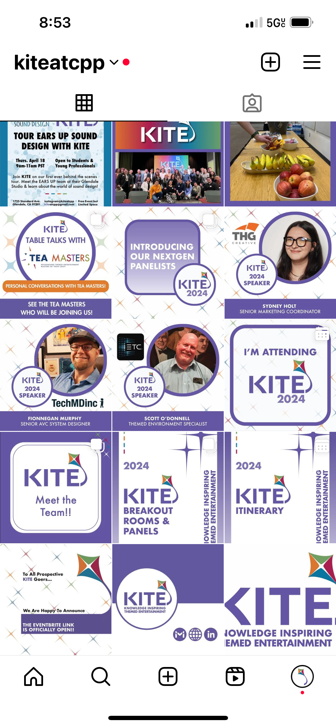
Now that I had the basis of our branding, I was able to apply these elements to our communications, social media, and collateral materials. It was time to see how well our branding could apply to the real world.
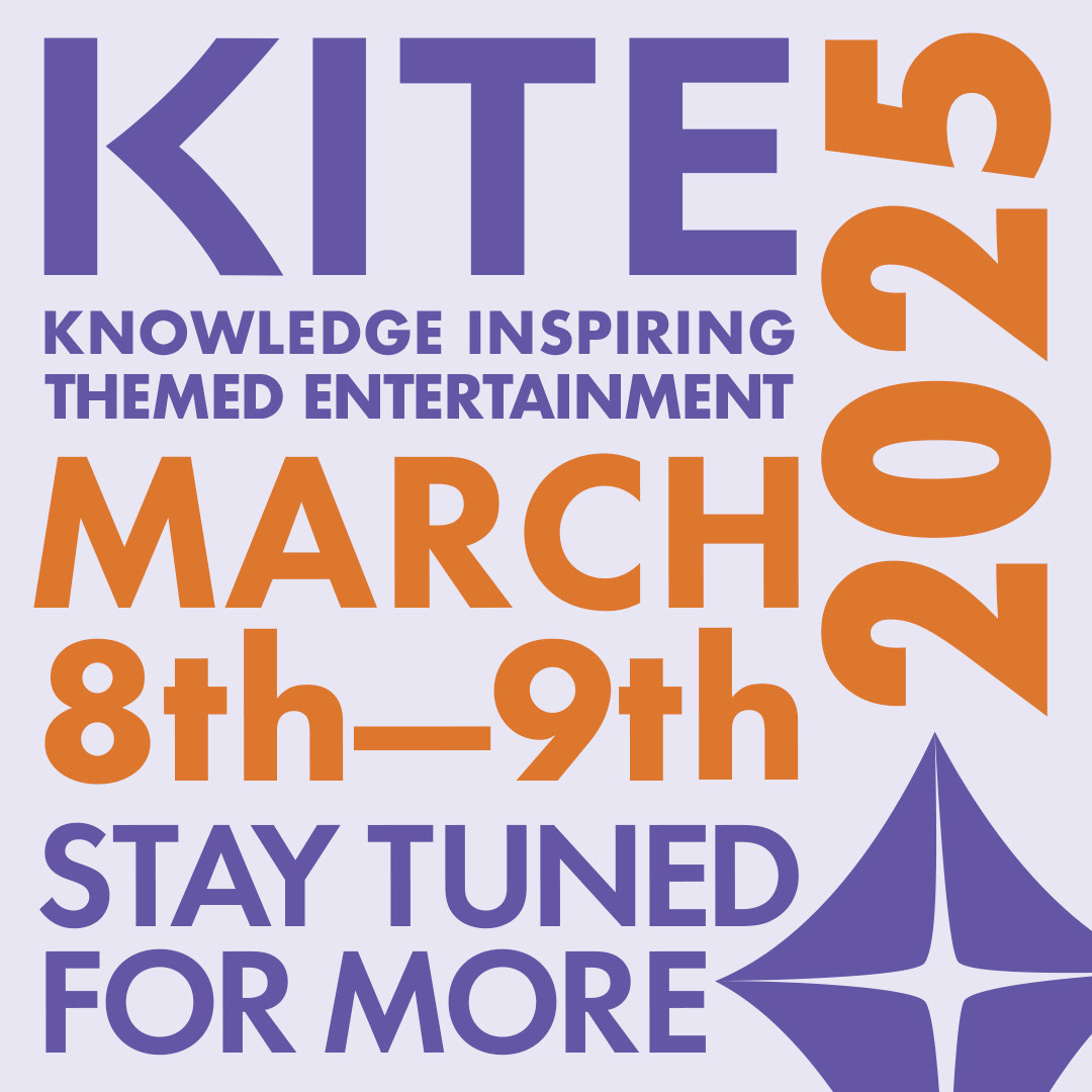
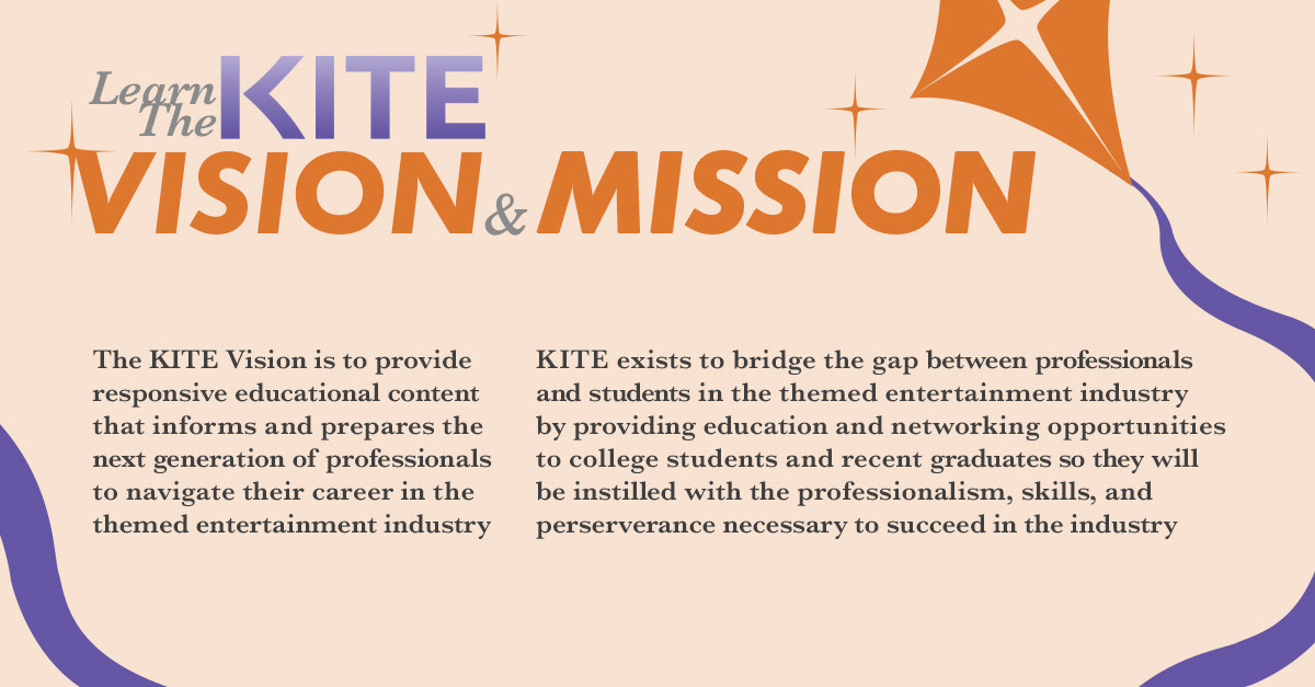
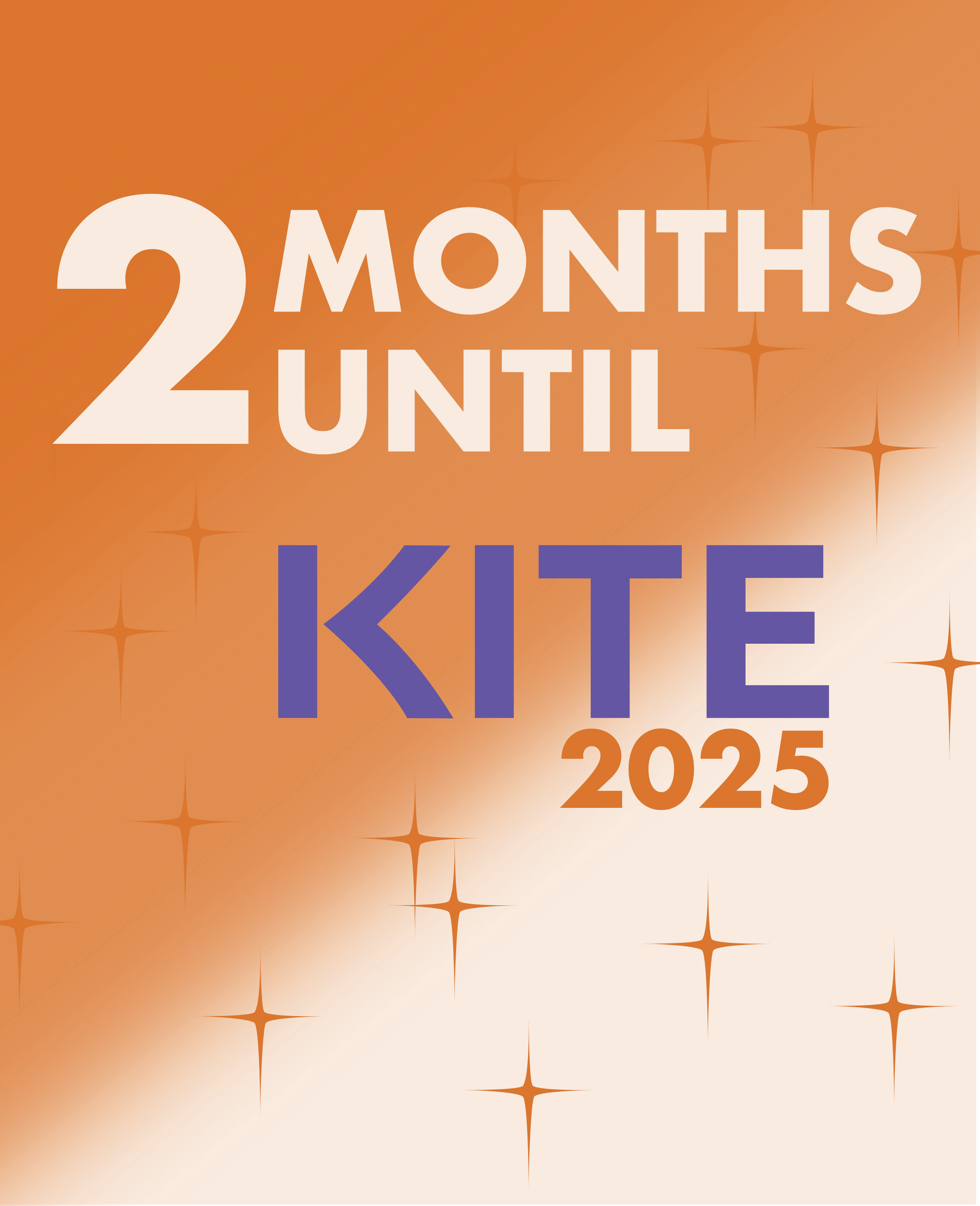
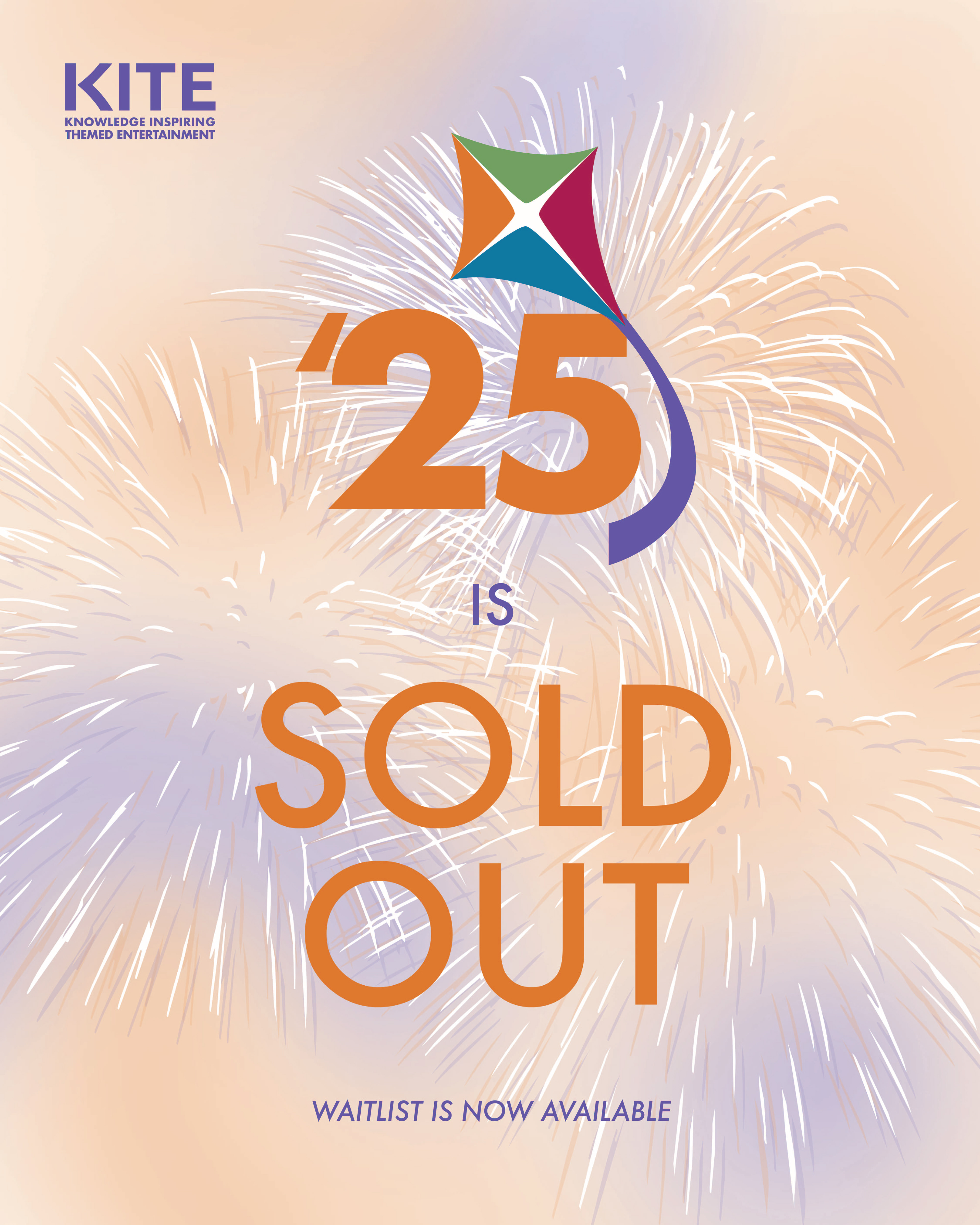
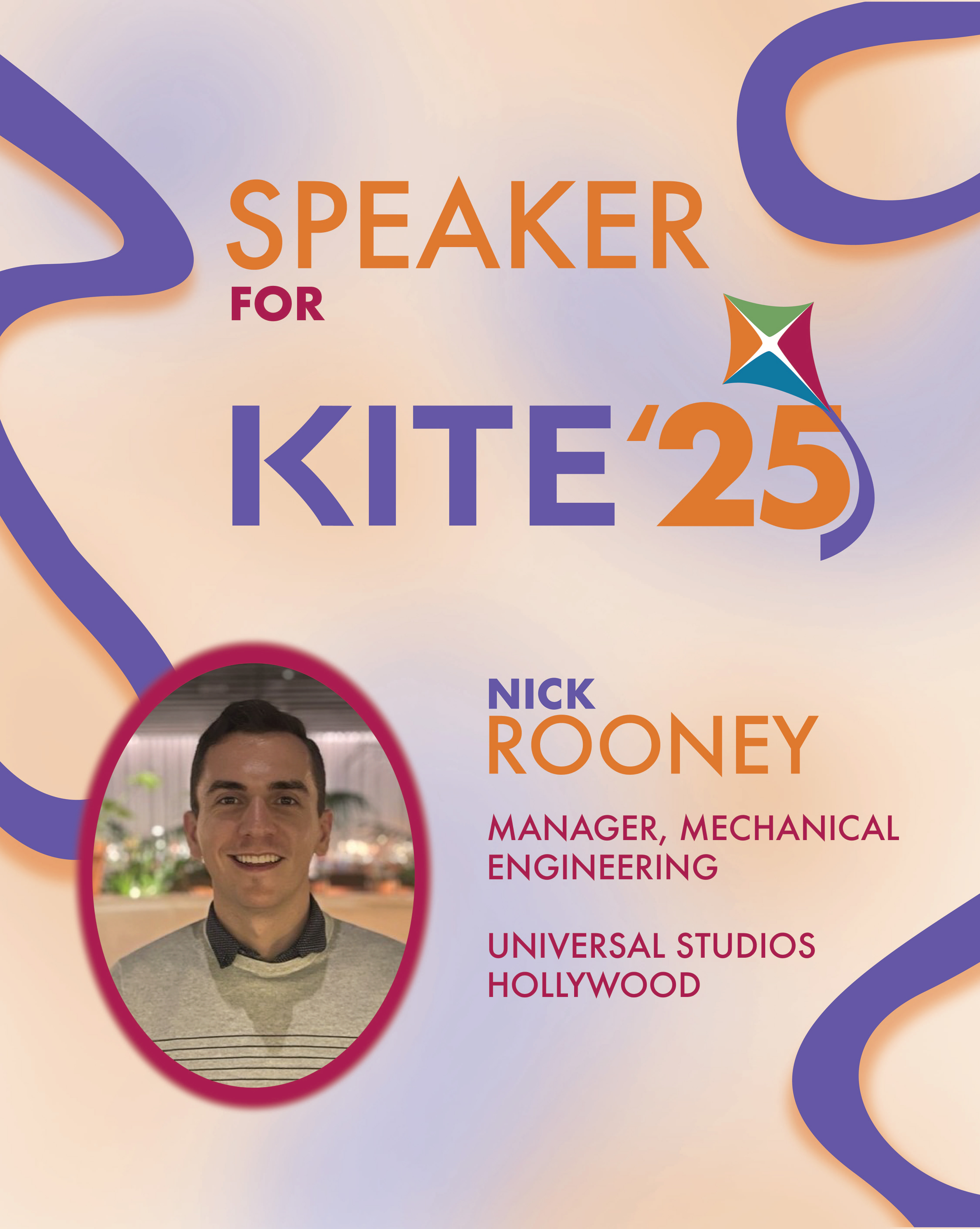
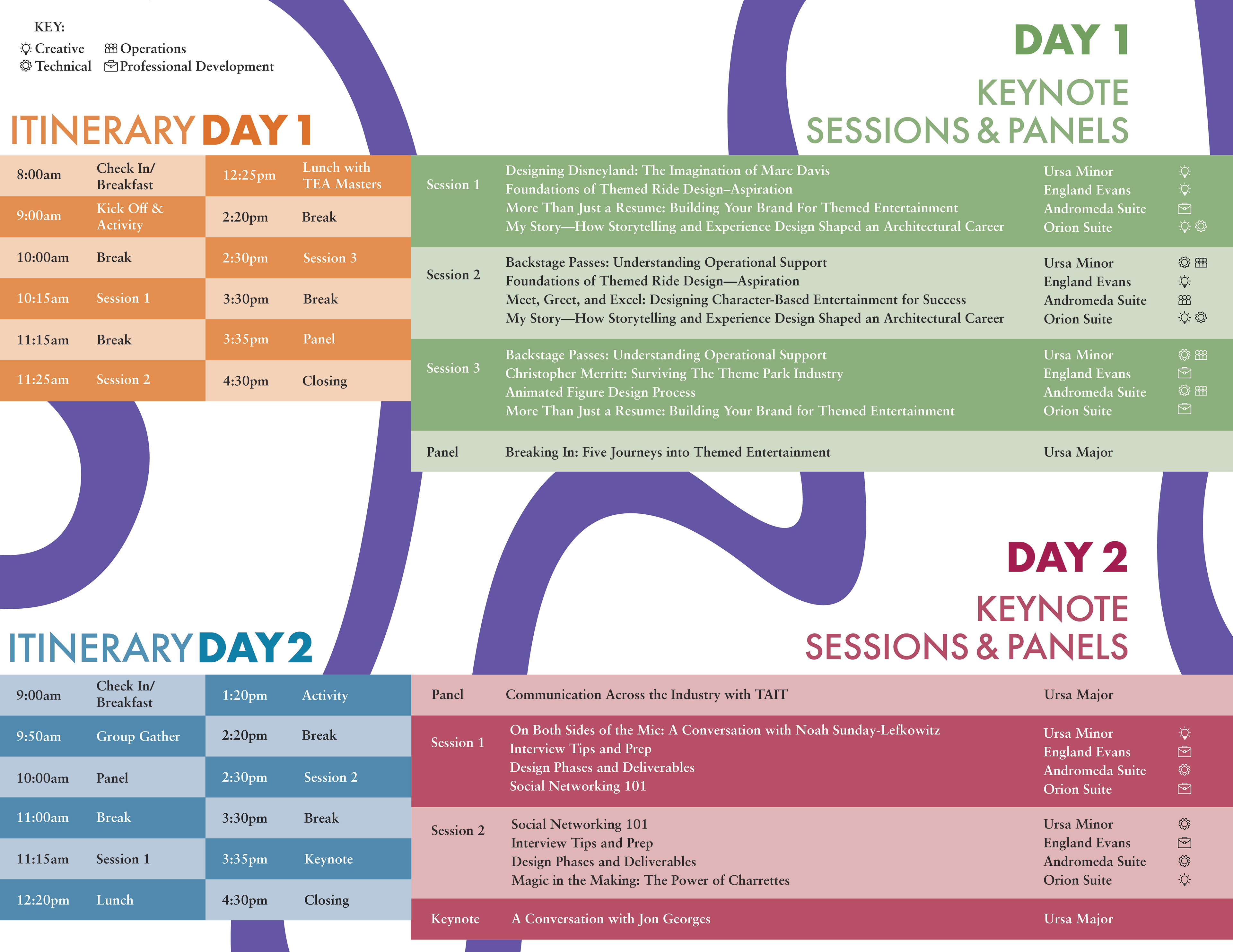
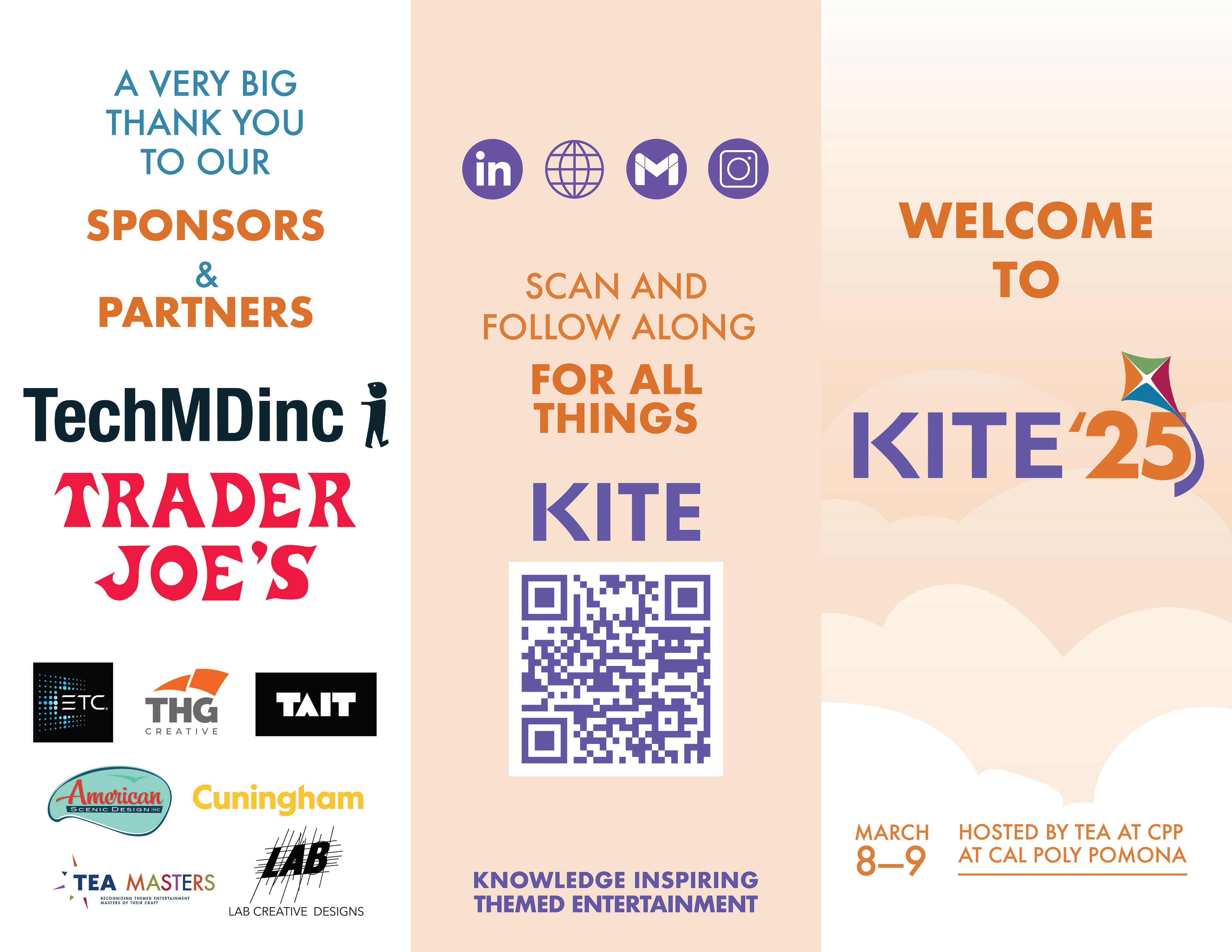
COMMUNICATIONS
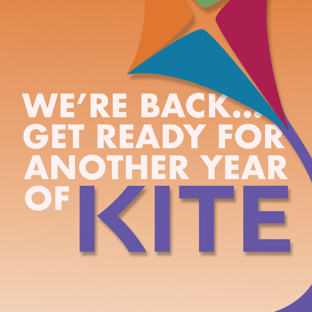
SOCIAL MEDIA
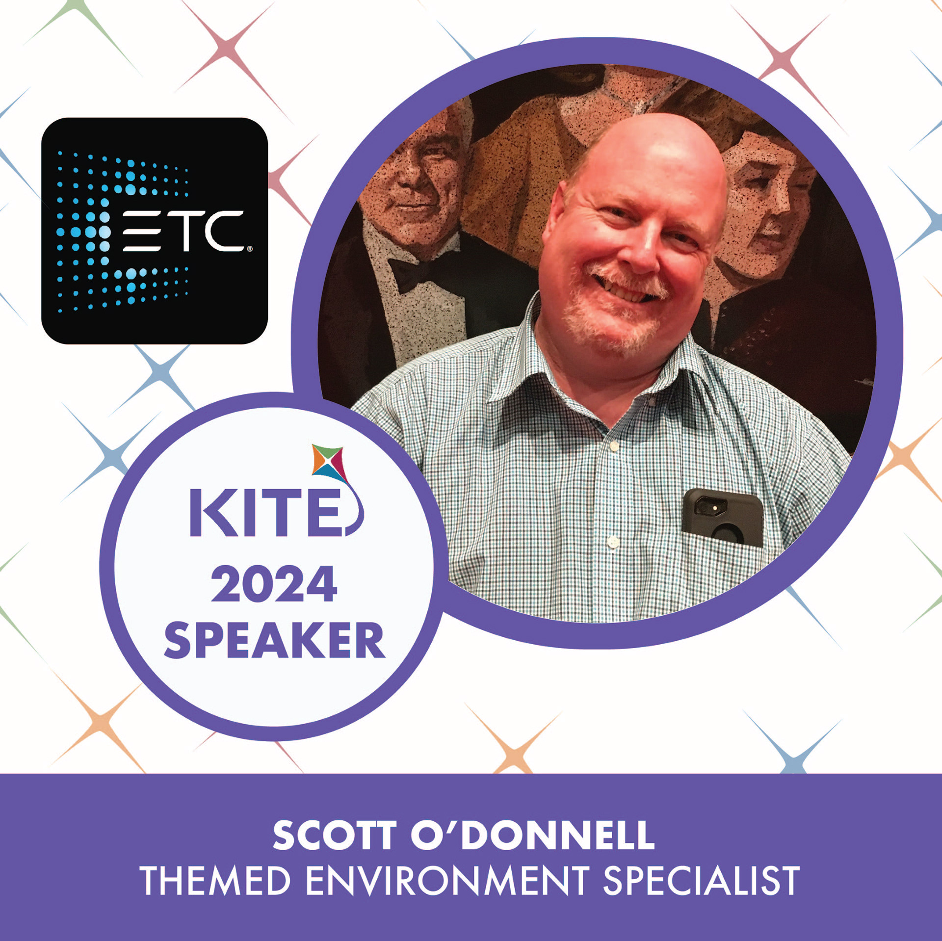
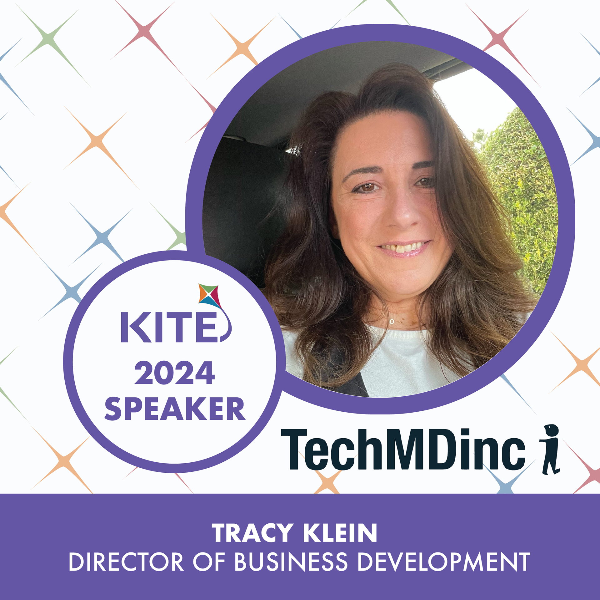
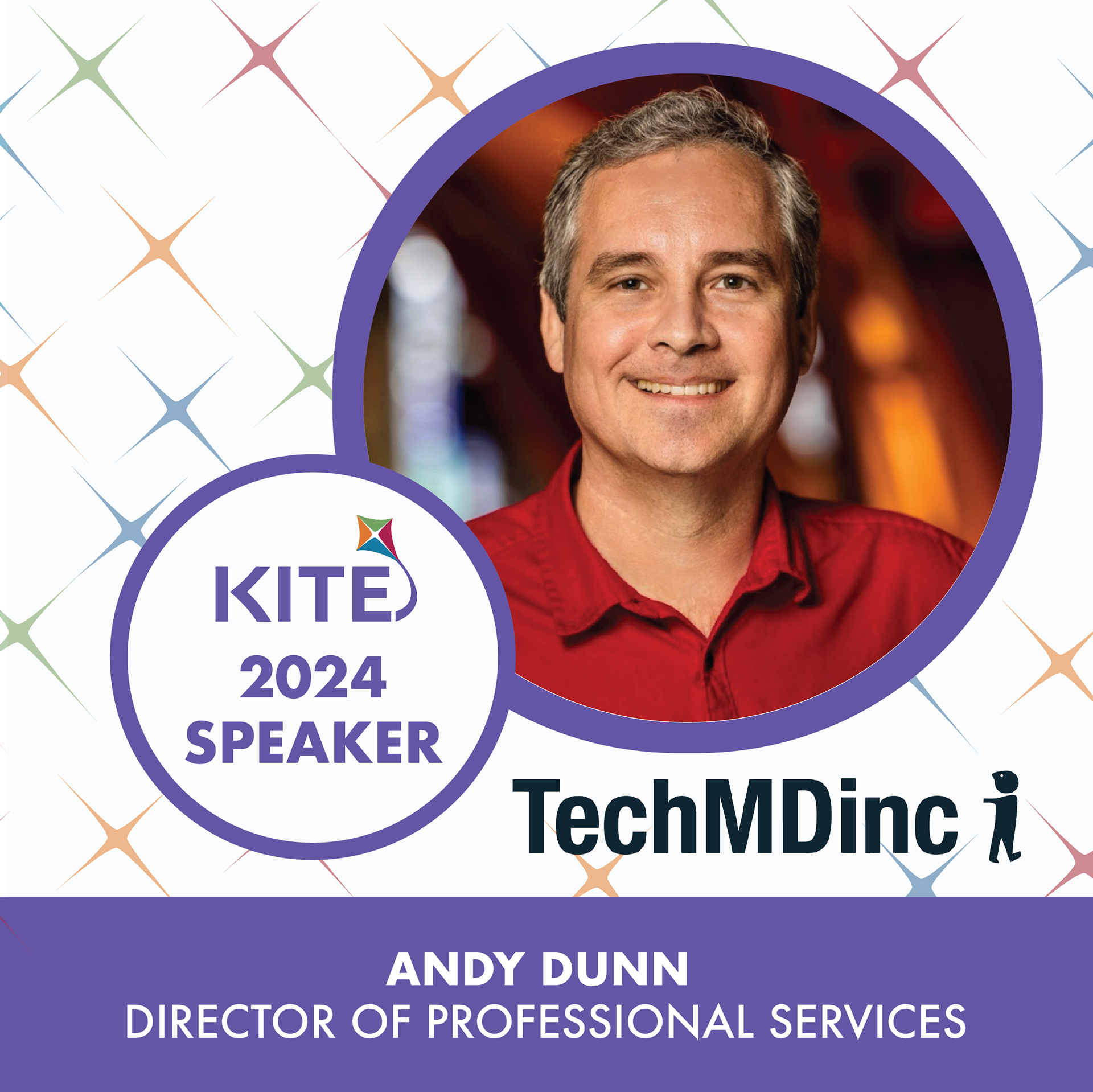
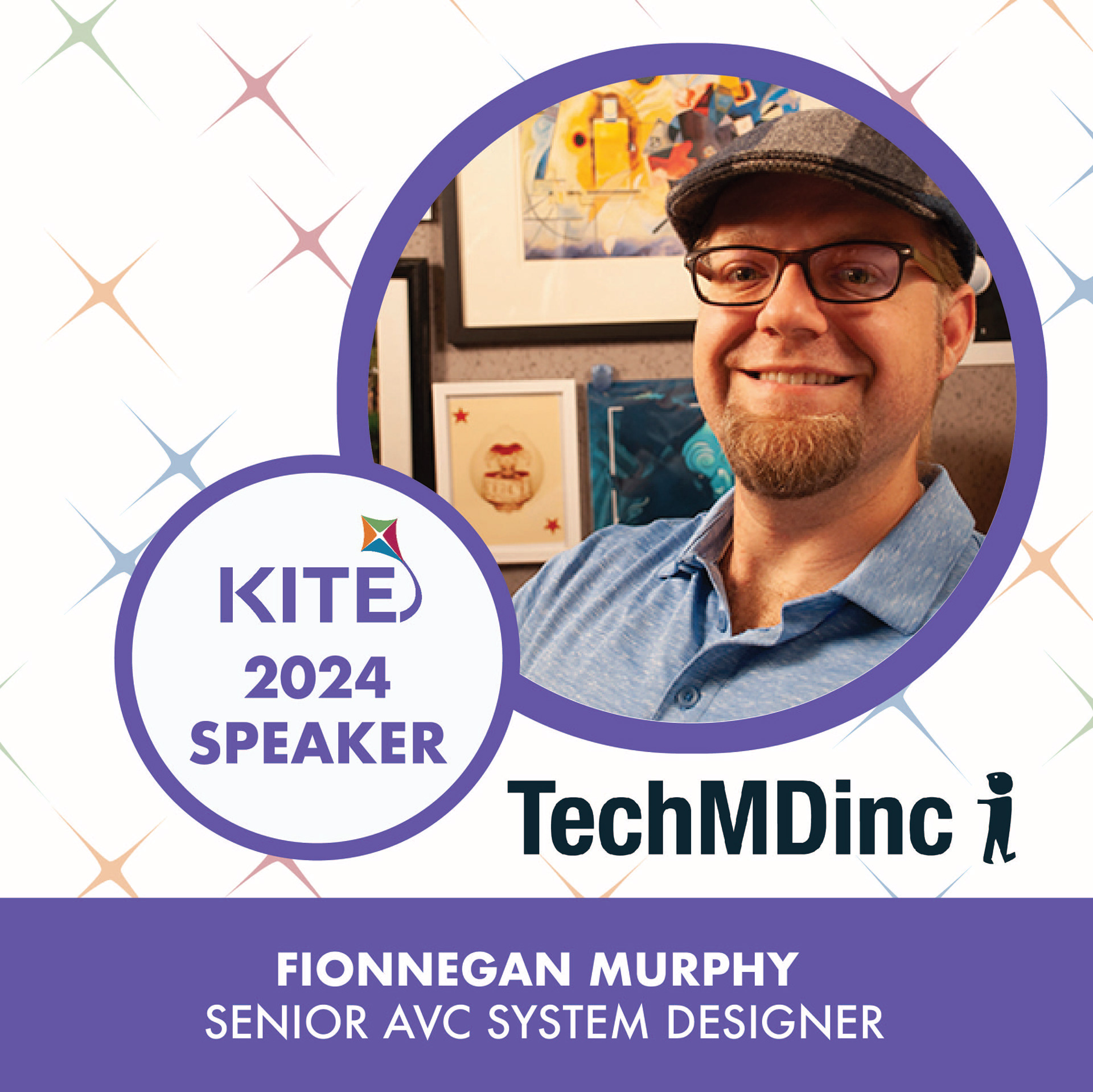
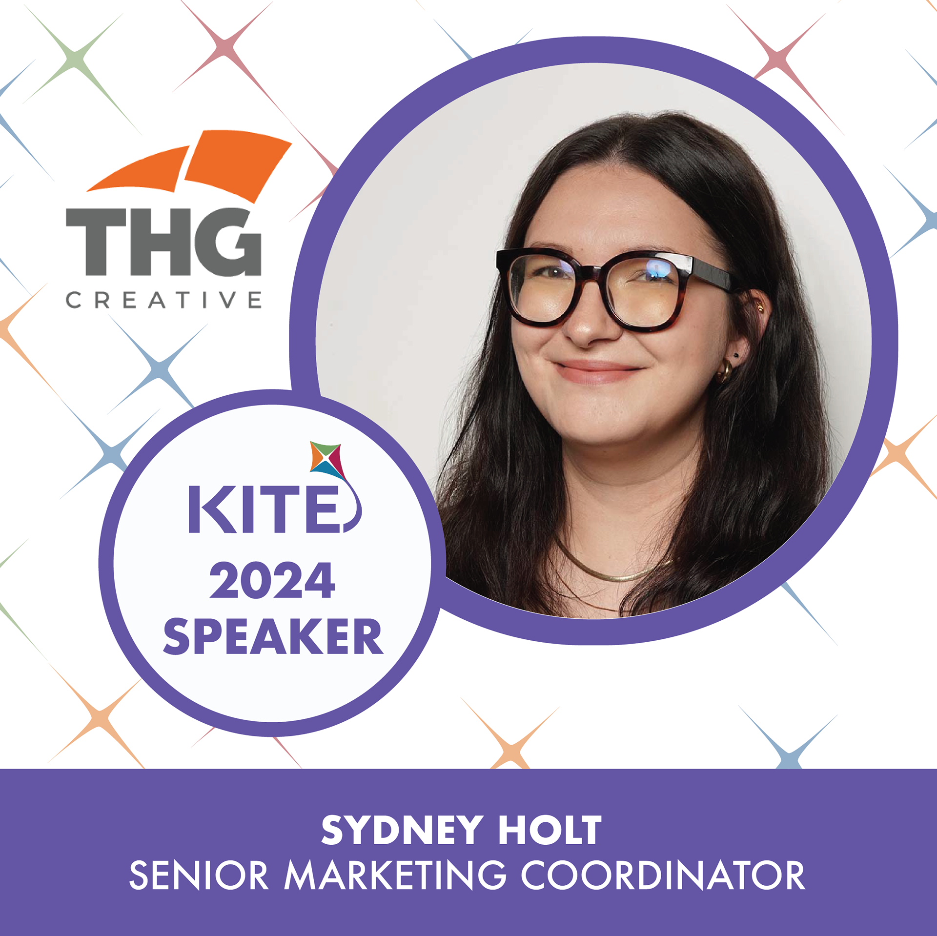
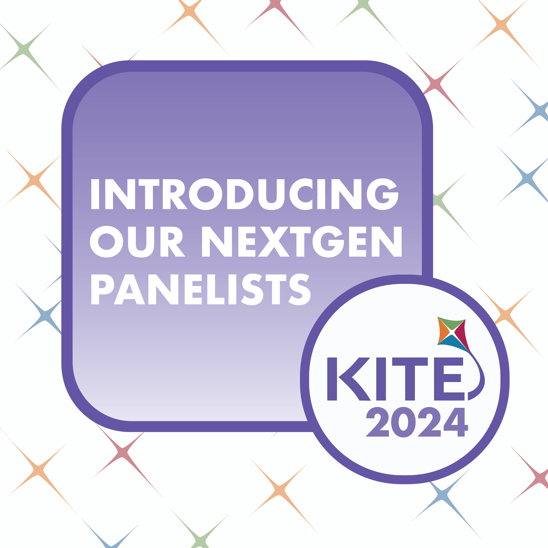

A large part of my responsibility following the establishment of our branding, was creating content to help establish a social media presence for the conference.
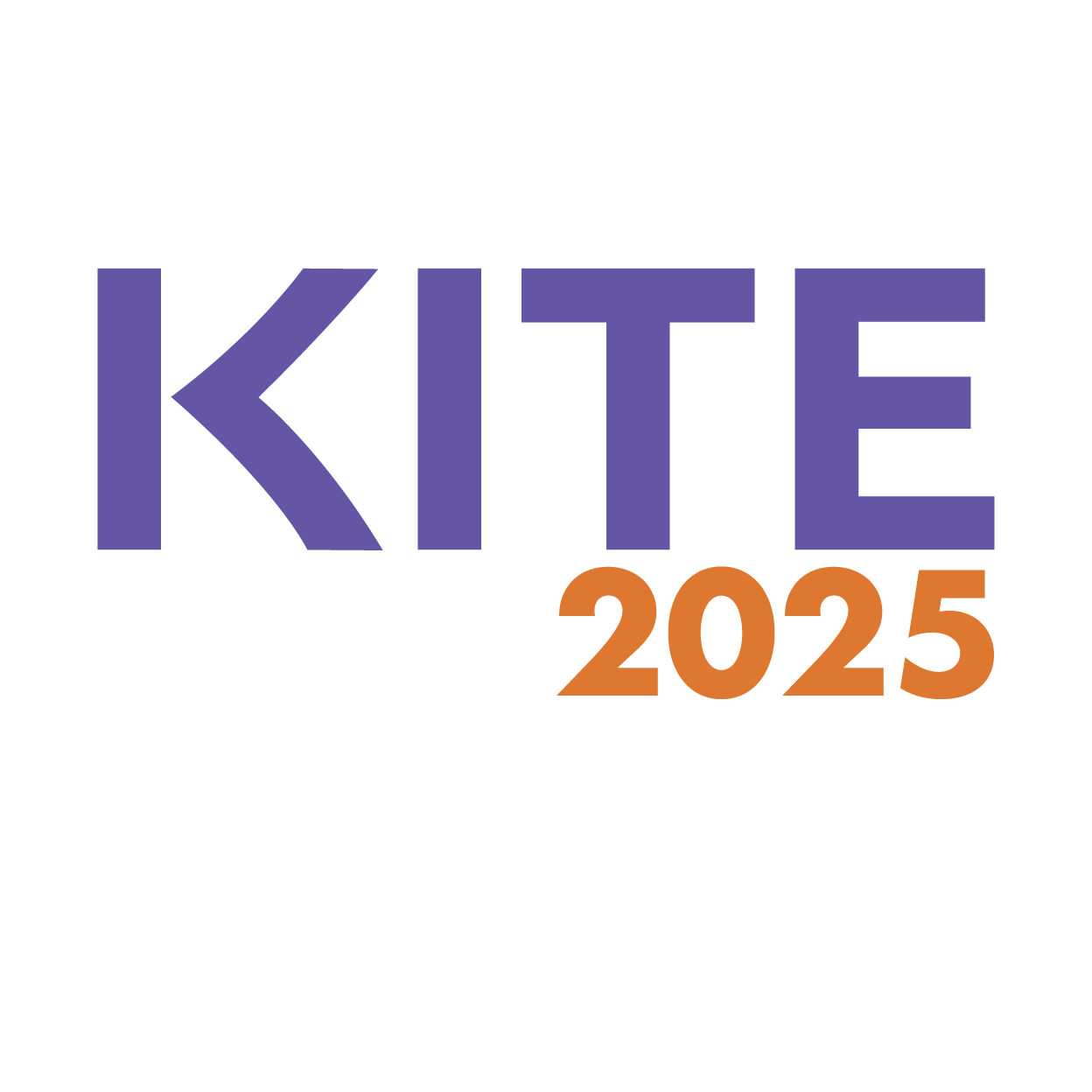
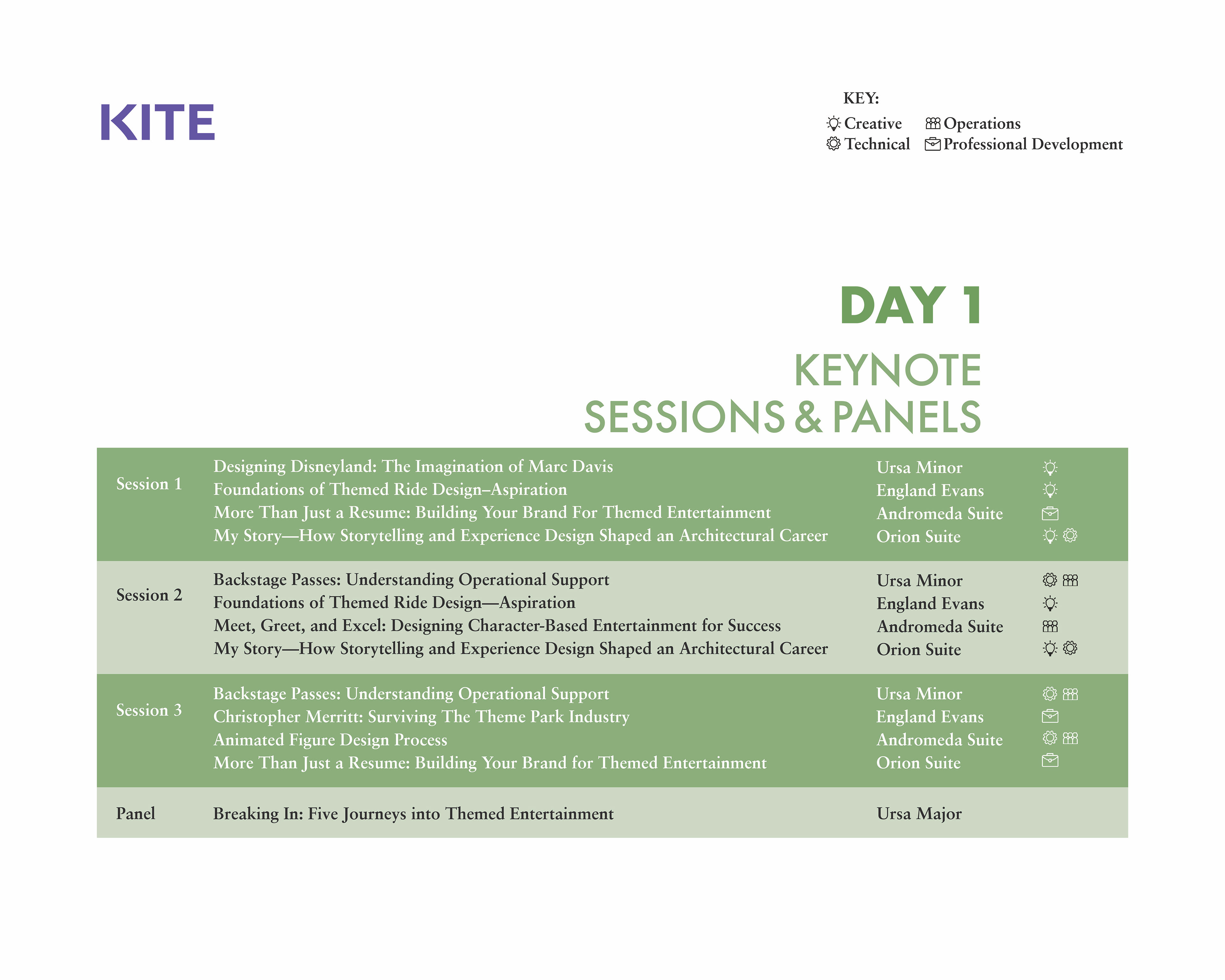
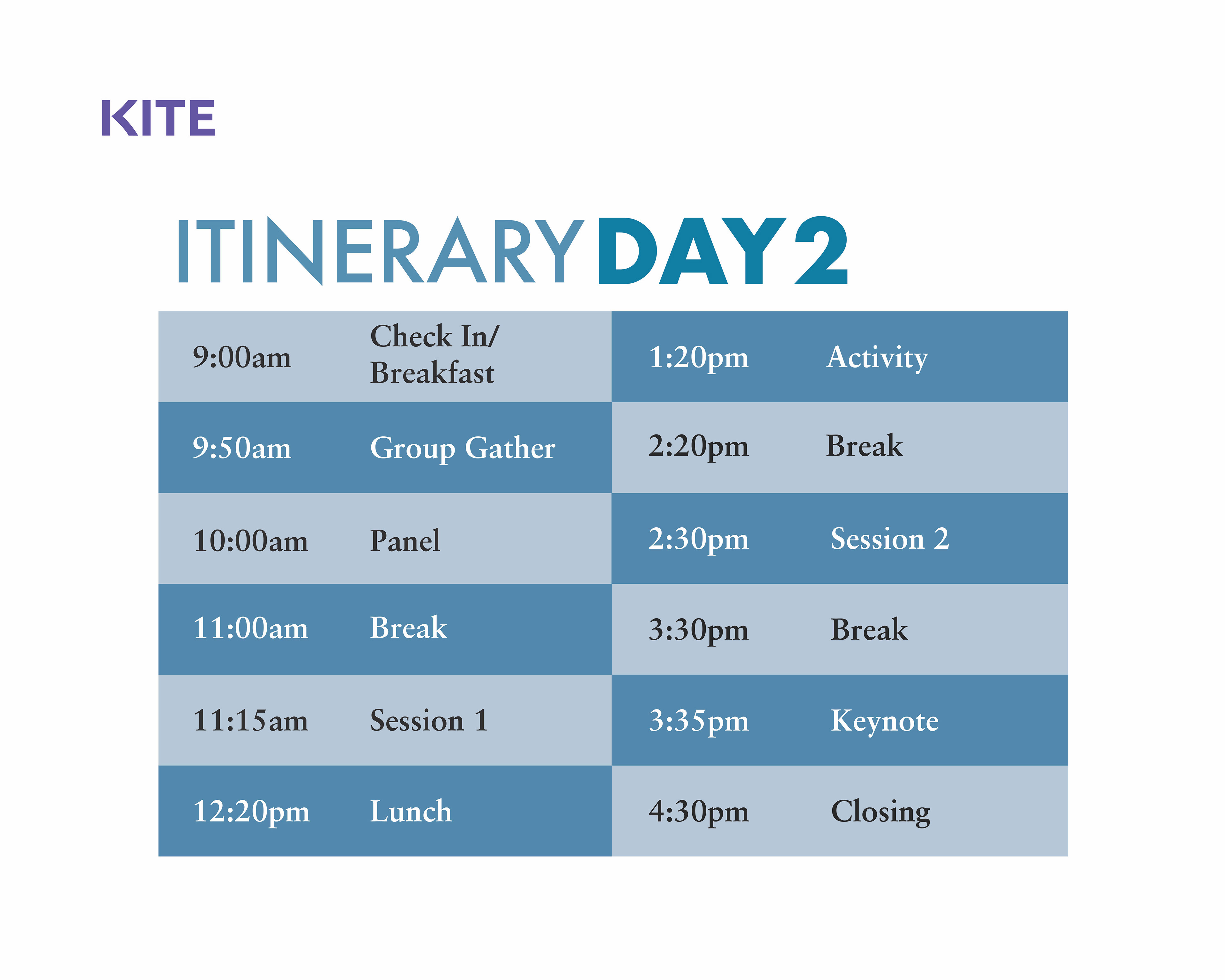
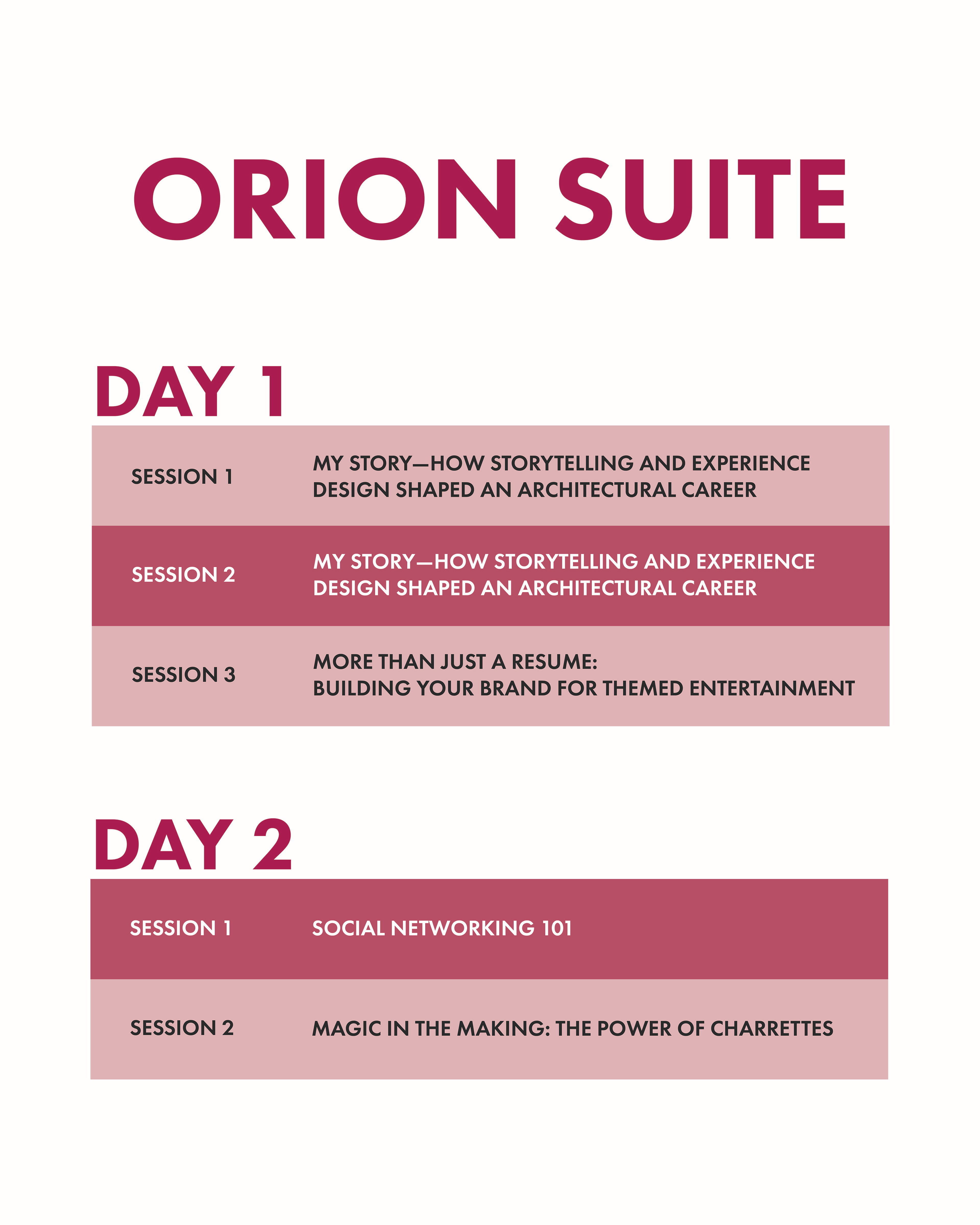
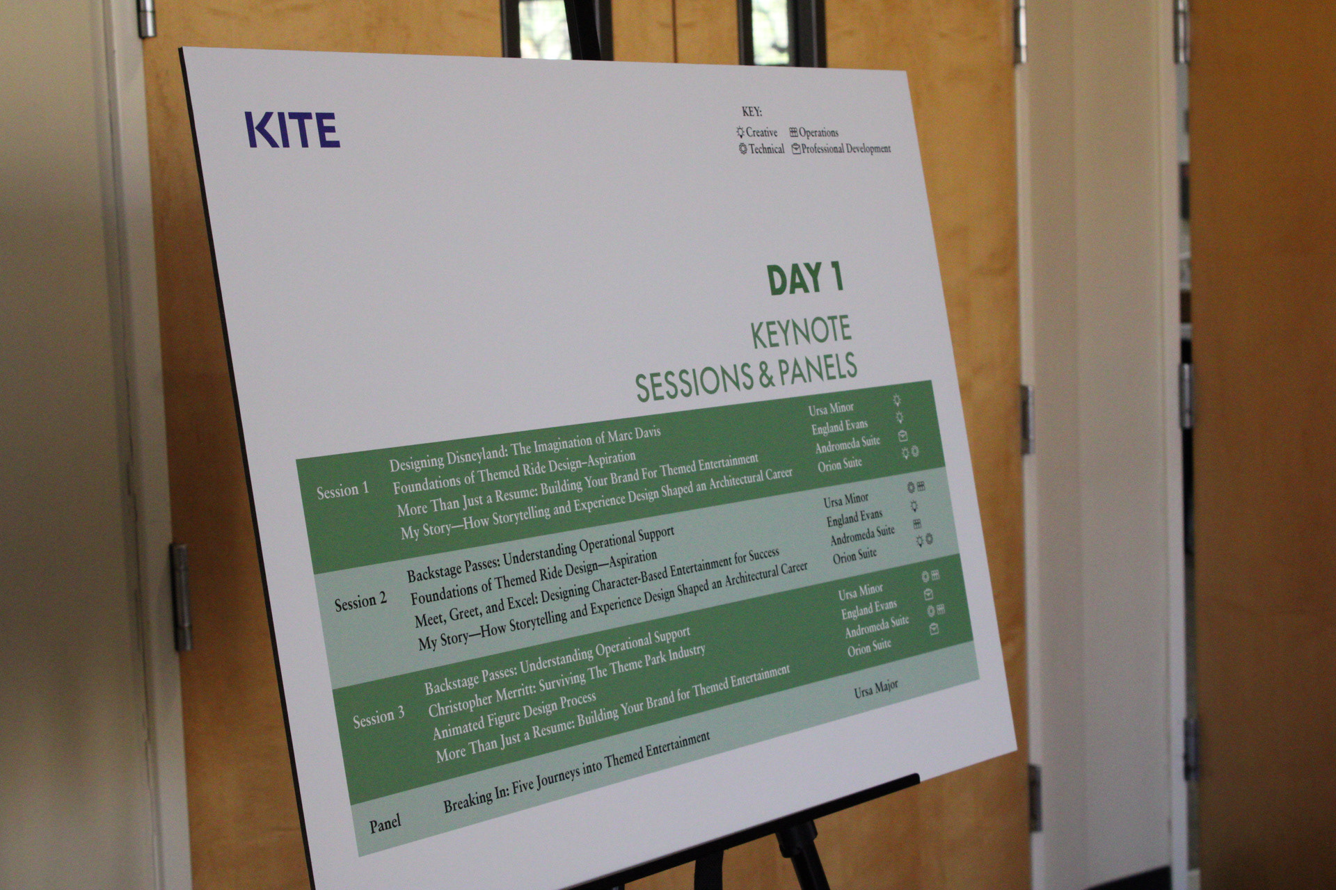
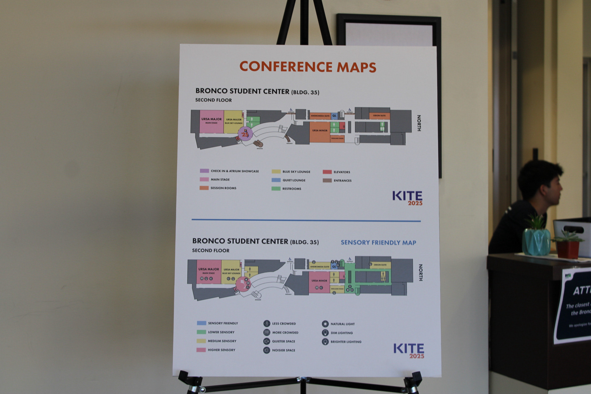
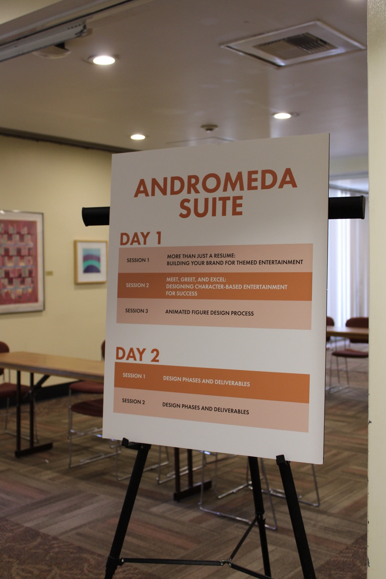
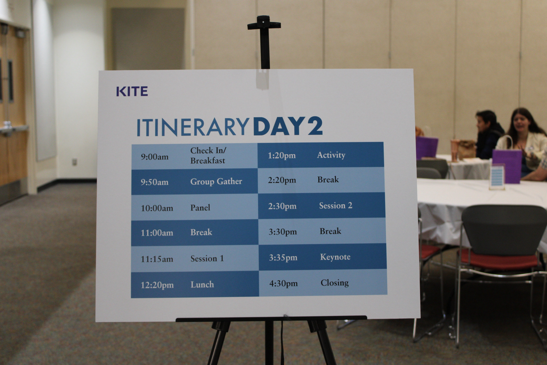
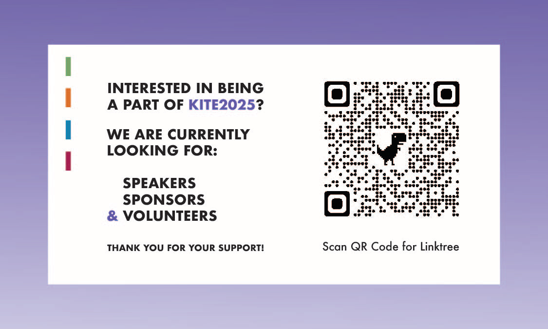
KITE 2025